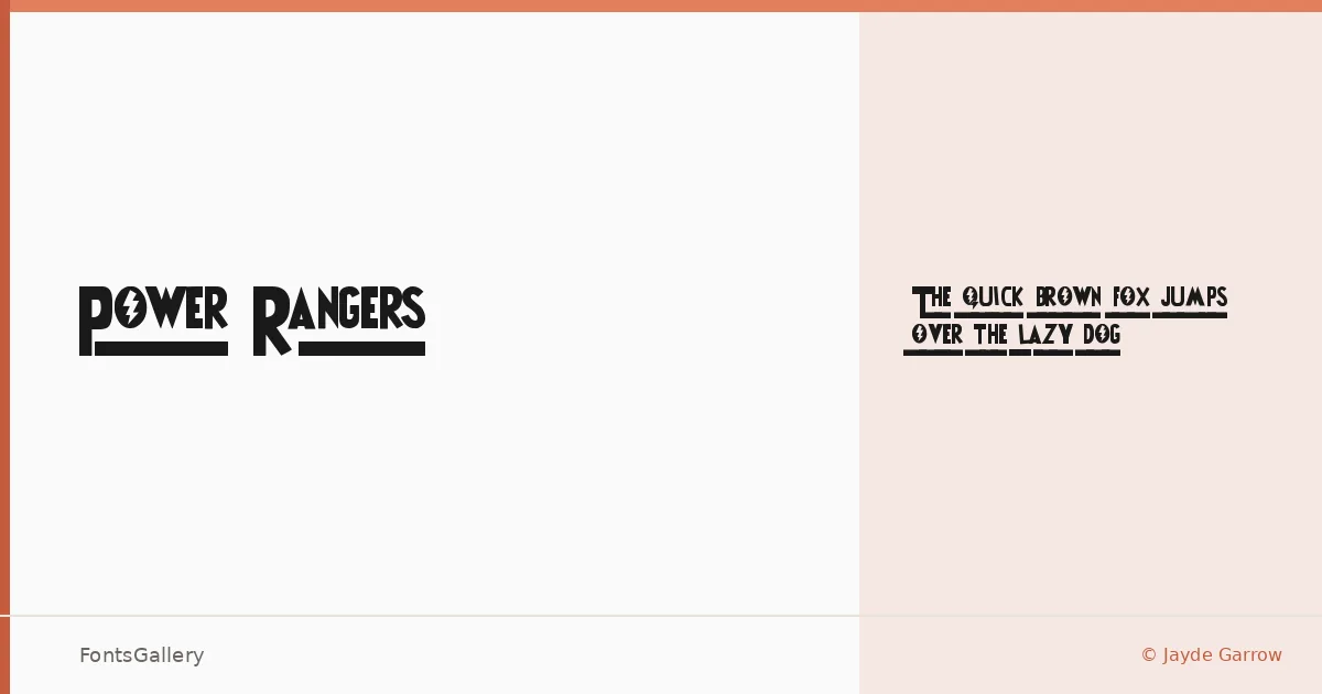
About Power Rangers Font
There is an immediate confidence to this display face — the kind of bold, classic weight that announces itself before you read a single word. Designed by Jayde Garrow, it carries a vintage energy that feels pulled from an era of hand-lettered signage and screen-printed graphics. The single Regular Normal cut was built in FontCreator 6.0, keeping the family focused and intentional rather than sprawling.
Design Aesthetics & Character Characteristics
This is unambiguously a display typeface, designed to live large rather than run in text columns. Its mood sits at the intersection of bold and classic, with enough vintage character to feel nostalgic without tipping into pastiche. With only one style in the family, the design puts everything into that single cut — the letterforms earn their weight rather than relying on a range of widths to do the work. The file ships as a TTF, with editable embedding permissions.
Recommended Usage & Font Pairing
The face is built for headlines, posters, logos, and branding situations where presence matters — it also translates well to T-shirt design, where that bold vintage character reads clearly across a garment. For pairing, the neutrality of Helvetica or Aileron makes a clean counterpoint to its personality, while Canela brings a softer editorial contrast; Anglecia Pro and Abrade offer more character-driven alternatives for layouts that want texture throughout.
License & Usage Terms
This family is released under Donationware terms, which means commercial use is not permitted — confirm licensing directly with the designer before committing it to any commercial job.