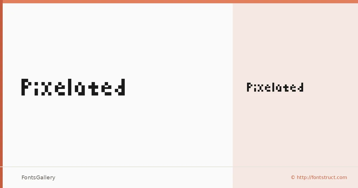
About Pixelated Font
There is something immediately deliberate about this face — every letterform is constructed from discrete, grid-locked units that make the pixel structure the whole point, not an afterthought. It was built by Greenma201 using FontStruct, and that construction-kit origin is worn openly in the design. The result is a single-weight display cut, available as a TTF, where the geometry is rigid and the retro-digital personality is impossible to miss.
Design Aesthetics & Character Characteristics
The family consists of one style — Pixelated Regular — so the character comes entirely from the letterforms themselves rather than from a range of weights. The mood sits at the intersection of futuristic and playful: blocky enough to read as bold at display sizes, yet open enough to carry a lighthearted tone. It belongs firmly in the display category, where headline scale lets the pixelated grid read with full impact rather than collapsing into noise.
Recommended Usage & Font Pairing
The face earns its place on posters, website headers, branding marks, and T-shirt graphics — anywhere a modern, eye-forward attitude matters more than text-setting refinement. Social media graphics in particular benefit from its immediate readability at cropped thumbnail sizes. For body copy or secondary text, it pairs well alongside Helvetica for a clean contrast, or with Aresink, Alexandria, Bizantheum, and Audex when a more consistently stylized palette is needed.
License & Usage Terms
This family is available for commercial use under a Creative Commons Attribution Share Alike license — the full terms are at creativecommons.org/licenses/by-sa/3.0/. Note that embedding is permitted for preview and print only, so factor that in if your workflow requires full embedding in interactive or editable documents.