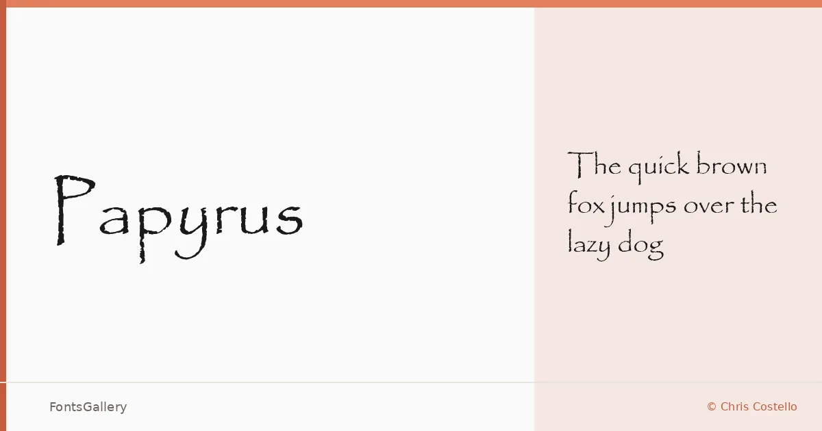
About Papyrus Font
There is something immediately tactile about these letterforms — the edges feel torn rather than cut, as if the ink has been drawn across fibrous, uneven material. Designed by Chris Costello, this single-weight display face carries the texture of ancient manuscripts into digital type, with strokes that breathe and terminals that fray in ways no geometric construction would permit.
Design Aesthetics & Character Characteristics
Sitting squarely in the display category, the family ships as a single Regular Normal weight in TTF format, which suits its purpose well — this is not a face you set in running text, but one you deploy deliberately, at size, where its rustic and vintage character can do its work. The mood shifts between whimsical and classic depending on context: paired with the right supporting type it reads as ceremonial, even ancient; used more loosely it carries a handcrafted warmth. Latin coverage keeps the character set focused.
Recommended Usage & Font Pairing
It earns its place on book covers, posters, certificates, and anywhere a logo or branding treatment calls for something that feels worn by time rather than engineered for precision. For supporting type, it pairs with Helvetica or Bahnschrift when you want clean neutrality to anchor the texture, with Canela when a literary softness suits the project, and with Etna or AQUA when the overall composition can carry more expressive weight throughout.
License & Usage Terms
This family is available for commercial use, and the TTF file is licensed with editable embedding permissions, meaning it can be embedded in documents that end users may modify.