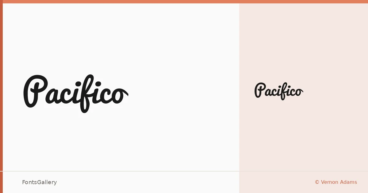
About Pacifico Font
There is a looseness to this script that feels like a signature dashed off with confidence — the strokes are fluid, the connections natural, and the overall rhythm leans back just enough to feel relaxed without losing legibility. Vernon Adams drew it with a warmth that reads as genuinely handmade rather than mechanically constructed. The family is available as a single Regular weight in TTF format.
Design Aesthetics & Character Characteristics
It sits squarely in the script category, carrying a mood that is simultaneously playful and romantic, with a vintage undercurrent that keeps it from reading as frivolous. The letterforms have rounded, generously proportioned bodies and smooth joins that give them an upbeat, modern energy even when the subject matter calls for a nostalgic touch. Because there is only one weight, its character has to come entirely from the drawing itself — and it does.
Recommended Usage & Font Pairing
It handles branding and logo work naturally, and its personality translates well to posters, social media graphics, and t-shirt design wherever you need a headline that feels personal and direct. Latin character coverage makes it a reliable choice across Western European languages. For pairing, the contrast between its curves and the rationality of Bahnschrift or Etna works well; Canela adds a literary warmth alongside it, while Times New Roman or ABC Arizona can ground it in something more editorial.
License & Usage Terms
Released under the SIL Open Font License, Version 1.1, with installable embedding permissions — commercial use is explicitly permitted.