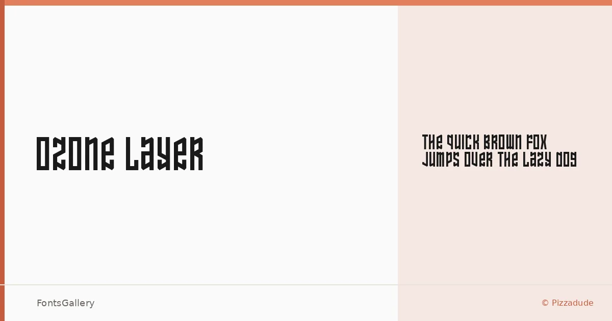
About Ozone Layer Font
There is a particular texture to this face — rough at the edges, deliberately worn, the kind of weight that reads from across a room. Ozone Layer is a single-cut display typeface designed by Pizzadude (Jakob Fischer), built for headlines and graphic applications where a grunge-inflected character is the whole point.
Design Aesthetics & Character Characteristics
The family arrives as one style — Regular — in TTF format, so its personality lives entirely in its letterforms rather than a range of weights. The mood sits at an interesting cross-section: bold and modern in its structure, vintage and grunge in its surface treatment. Latin coverage keeps it focused. These are letters that feel like they were pulled from a worn silkscreen or a hand-cut stencil, and that specificity is exactly what makes them useful in the right context.
Recommended Usage & Font Pairing
The face earns its keep in branding, poster work, logo lockups, and T-shirt design — anywhere a headline needs presence and a little edge. When you need to soften or balance its rough character, it pairs well against the refined structures of Canela, ABC Arizona, or Etna, and reads cleanly alongside the mechanical neutrality of Helvetica or Bahnschrift.
License & Usage Terms
This family is available under Personal Use terms only — commercial use is not permitted and embedding is restricted, so confirm your licensing situation carefully before committing it to a client job or commercial production.