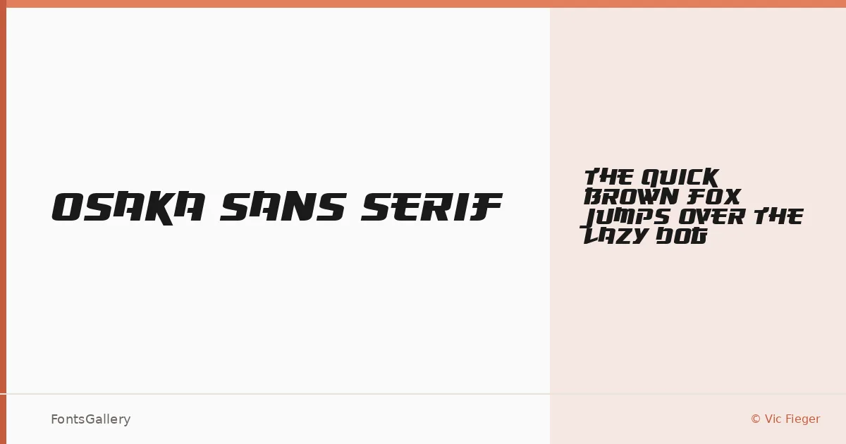
About Osaka Sans Serif Font
There is something immediately deliberate about this face — a clean, geometric authority that lands somewhere between signage culture and digital futurism. Designed by Vic Fieger and built using the Font Creator Program from High-Logic, it arrives as a single Regular weight in TTF format, lean and focused in its intent.
Design Aesthetics & Character Characteristics
This is a display sans with a modern, forward-leaning mood — the kind of letterforms that hold their shape at large sizes without apology. The cuts feel bold in presence even at a single weight, carrying a futuristic edge that reads clearly in Latin across headlines, logotypes, and print applications. There are no companion italics or extended weights here; the design commits fully to one voice.
Recommended Usage & Font Pairing
It earns its keep in branding systems, poster hierarchies, logo lockups, and T-shirt graphics — anywhere the type needs to carry visual weight on its own terms. For contrast in a layout, it sits well alongside Canela's editorial warmth or the familiar authority of Times New Roman; pairing with Bahnschrift, Helvetica, or Etna keeps things in a cooler, more systematic register depending on the project's tone.
License & Usage Terms
This family is available for commercial use, so you can deploy it in client work without restriction. Embedding is permitted at the editable level.