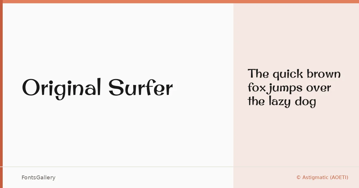
About Original Surfer Font
There is a particular confidence in the letterforms here — wide, unhurried strokes that carry both weight and a certain coastal ease. This display face comes from Brian J. Bonislawsky of Astigmatic (AOETI), a foundry with a long history of distinctive character-driven type. The single Regular cut is enough: it arrives fully formed, with the kind of presence that does not need a whole weight range to make itself known.
Design Aesthetics & Character Characteristics
Sitting squarely in the display category, Original Surfer reads as bold and modern while holding onto something genuinely elegant — a combination that is harder to pull off than it looks. The forms have an organic looseness that keeps them from feeling cold, even as the overall impression is polished and deliberate. Delivered as a TTF with installable embedding permissions, it is a practical choice for environments where reliability across systems matters.
Recommended Usage & Font Pairing
This is headline and poster territory above all else — the sort of face that anchors a magazine spread or carries a branding or logo lockup without needing much support. Latin-language projects are its natural home. For body or supporting text, it pairs well with Canela or ABC Arizona when you want editorial warmth, with Helvetica or Bahnschrift when you want clean contrast, and with Etna when a closer stylistic relationship suits the brief.
License & Usage Terms
Original Surfer is released under the SIL Open Font License (OFL), Version 1.1, which permits commercial use — full terms and the accompanying FAQ are available at http://scripts.sil.org/OFL.