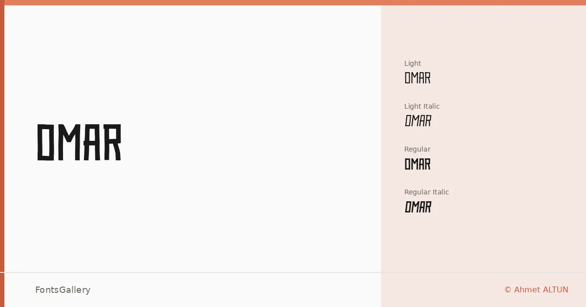
About Omar Font
There is a clarity to these letterforms that takes a moment to settle — clean strokes pulled tight, with just enough tension to feel considered rather than cold. Ahmet ALTUN designed this display family, and the result carries a quietly futuristic sensibility without leaning on novelty tricks. It comes as OTF files across Latin character coverage.
Design Aesthetics & Character Characteristics
The family spans four cuts: Light, Light Italic, Regular, and Regular Italic. That tight range is part of the point — this is minimal by intention, built for situations where one well-chosen weight does the work. The forms sit somewhere between modern geometric restraint and the kind of bold confidence you want at large display sizes, with the italics adding enough slant to shift the rhythm without breaking it.
Recommended Usage & Font Pairing
It earns its place in branding, poster work, editorial headlines, and logo lockups where Latin copy needs to feel sharp and contemporary. For pairings, the neutrality of Helvetica or Bahnschrift holds it steady in a layout, while Canela or Times New Roman underneath it creates a useful contrast between the geometric display line and a warmer text face. Etna is another option when you want something with a bit more structural weight in the body.
License & Usage Terms
This family is released under Personal Use terms — commercial use is not permitted, so confirm licensing directly with Ahmet ALTUN before taking it into a paid job. Embedding is set to installable.