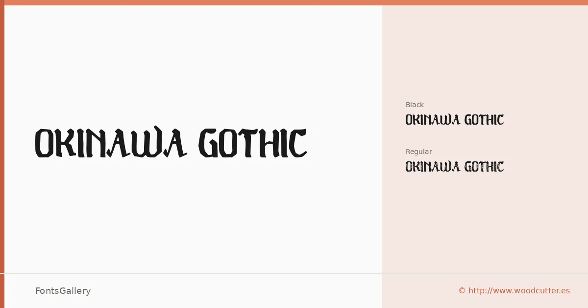
About Okinawa Gothic Font
There is a controlled roughness to these letterforms — a grunge texture worked into gothic proportions that feels deliberate rather than accidental. The family comes from Woodcutter Manero's Fonts Lab and arrives in two cuts: a Regular weight and a Black, both in OTF format. The Black in particular carries real presence, the kind of weight that reads across a room.
Design Aesthetics & Character Characteristics
This is a display face that sits at the intersection of vintage character and bold, classic structure. The grunge detailing gives both the Regular and Black cuts an aged, worn quality without tipping into illegibility — the underlying gothic forms stay solid underneath the surface noise. Latin coverage keeps the character set focused, and the OTF files are built with installable embedding permission.
Recommended Usage & Font Pairing
The natural home for this family is anywhere impact is the brief: poster headlines, logo lockups, branding with an edge, and T-shirt graphics where the vintage-grunge tension is an asset rather than a liability. Paired against the clean geometry of Helvetica or Bahnschrift, the roughness reads as intentional contrast; alongside the editorial warmth of Canela or ABC Arizona, it gains a more curated, magazine-ready quality. Etna makes a strong companion when you want to stay within the bold, high-contrast register.
License & Usage Terms
Okinawa Gothic is released under Personal Use terms — commercial use is not permitted, so confirm clearance before taking it into a client job by contacting Woodcutter Manero directly at [email protected] or via http://www.woodcutter.es.