About Oito Font
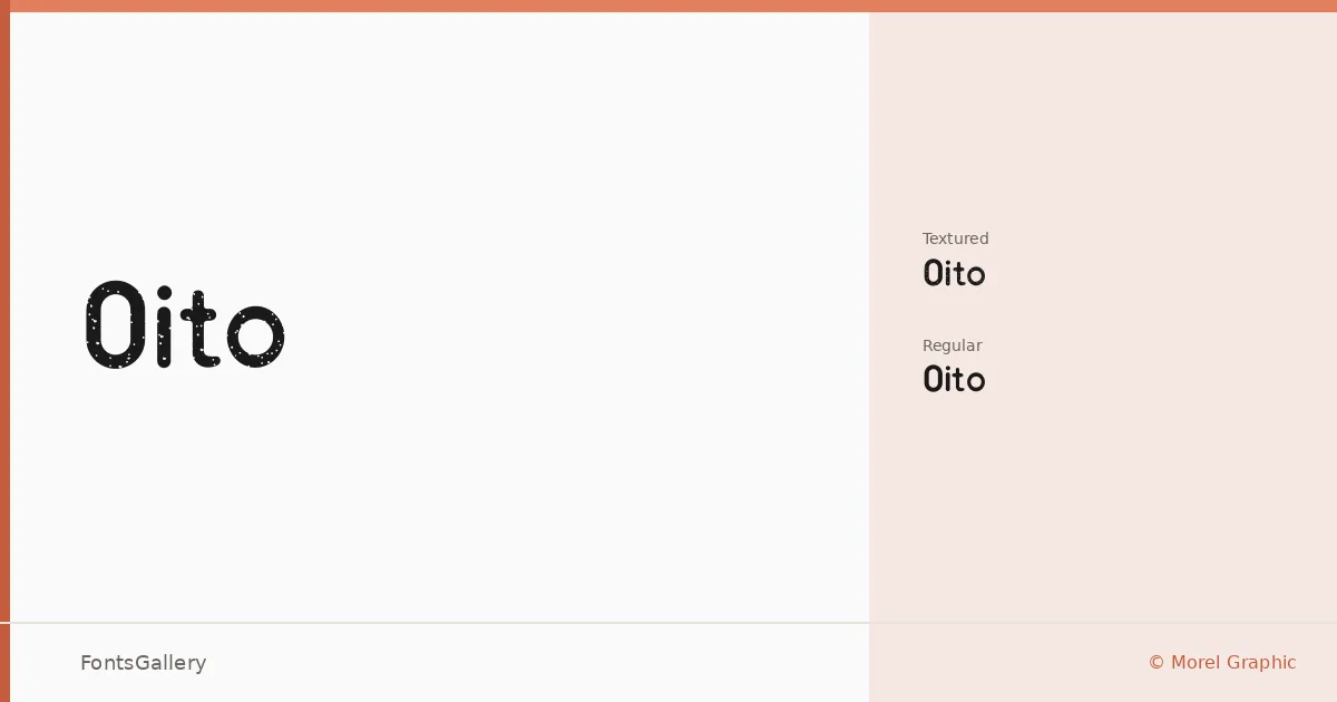
There is a deliberate economy to these letterforms — each one stripped to its structural essentials, nothing carried that doesn't need to be there. Oito is a display family designed by Morel Graphic, arriving in two cuts: a clean Regular and a Textured variant that introduces surface grain to the same underlying architecture. Both are delivered as OTF files.
Design Aesthetics & Character Characteristics
The family sits squarely in display territory, built around a modern, minimal sensibility with enough weight and confidence to anchor bold, professional work. The Regular reads with crisp geometric clarity, while the Textured version adds an analog quality — roughened edges that bring warmth and tactile interest without abandoning the underlying structure. Together the two styles give you a choice between precision and character within the same formal language. Latin coverage is partial, so review the glyph set against your copy before committing.
Recommended Usage & Font Pairing
This family is built for headline work: brand identities, logo lockups, posters, and T-shirt graphics where a single typeface needs to carry visual weight on its own. The Textured cut in particular suits contexts where a worn or printed feel is desirable. For text accompaniment, it pairs naturally with the neutrality of Helvetica or Bahnschrift, the editorial warmth of Canela or Times New Roman, and the structured character of Etna.
License & Usage Terms
Oito is available for commercial use, and embedding is permitted at the installable level — meaning you can embed the fonts in documents and applications that allow further editing.