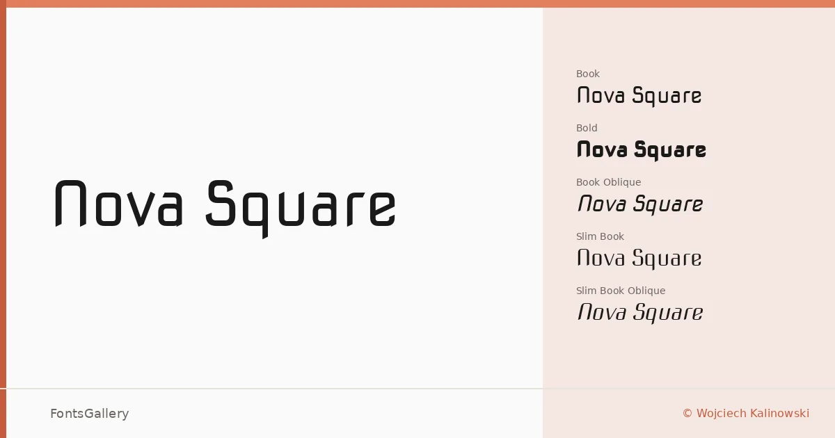
About Nova Square Font
There is something distinctly architectural about the letterforms here — terminals cut flat, curves restrained to near-geometric precision, and a rhythm that reads as deliberately engineered rather than drawn. Wojciech Kalinowski built this display family around a squared skeleton that holds its structure whether you're setting a single headline word or a full logotype lockup. The result is a Latin-script family delivered in TTF format with a clean, controlled personality.
Design Aesthetics & Character Characteristics
The family sits in display territory with a futuristic, minimal sensibility — the kind of type that reads as modern without shouting for attention. Eight cuts are available across two widths and two weights: Book and Bold in both the standard proportion and the condensed Slim, each paired with an Oblique companion. The Slim cuts introduce a leaner silhouette that intensifies the geometric discipline, while the Obliques add directional energy without softening the square-cornered character that runs through every style.
Recommended Usage & Font Pairing
The structured forms make this a natural fit for branding work, poster headlines, logo treatments, and website headers where a professional, forward-looking tone is needed. Because the design is grounded in Latin coverage, it works best in projects where that script is the primary requirement. For body text or supporting typography, it pairs well with Helvetica for a clean sans-on-sans contrast, or with Canela, Etna, ABC Arizona, or Asap when you want a more editorial or humanist counterpoint to the geometric display weight.
License & Usage Terms
Nova Square is released under the SIL Open Font License, Version 1.1, which allows commercial use freely and permits installable embedding; the font names "NovaSquare" and "Nova Square" are reserved under the terms of that license.