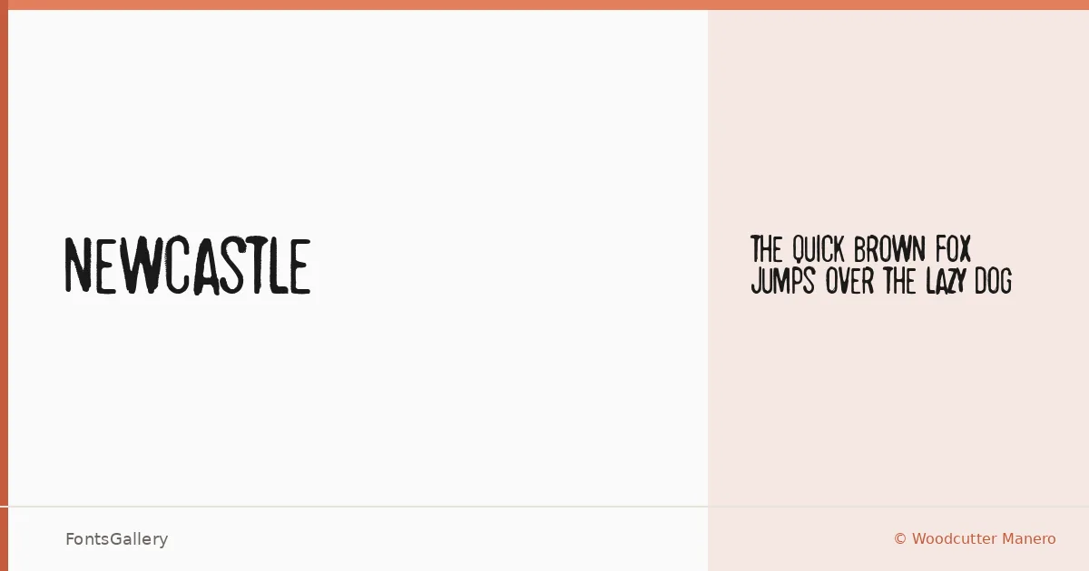
About Newcastle Font
There is a deliberate roughness to this display face — the kind of worn, hand-hewn quality that suggests ink pressed into coarse stock rather than pixels rendered on a screen. It comes from Woodcutter Manero, whose work carries a consistent handmade sensibility. Newcastle arrives as a single Regular weight in TTF format.
Design Aesthetics & Character Characteristics
Grunge and rustic instincts run through every letterform here, with a vintage heaviness that reads as bold even without a true Bold companion. The texture feels intentional rather than accidental — rough edges and uneven strokes that give headlines and logotypes an aged, tactile presence. Within the Latin character set, the forms hold their character at large sizes, which is exactly where a display cut like this belongs.
Recommended Usage & Font Pairing
The face earns its place in branding work, poster design, and T-shirt graphics where a raw, storied aesthetic is the point — anywhere a headline needs to look like it was pulled from an old broadside or a workshop sign. When you need a cleaner counterpart to balance that grit, the listed pairing options span a wide range of dispositions: the neutral structure of Helvetica or Aileron, the editorial warmth of Canela, the sharpness of ABC Arizona, and the geometry of Abrade all offer useful contrast.
License & Usage Terms
Newcastle is available under Personal Use terms only — commercial use is not permitted, so confirm licensing with Woodcutter Manero directly at [email protected] or via woodcutter.es before placing it in any commercial job.