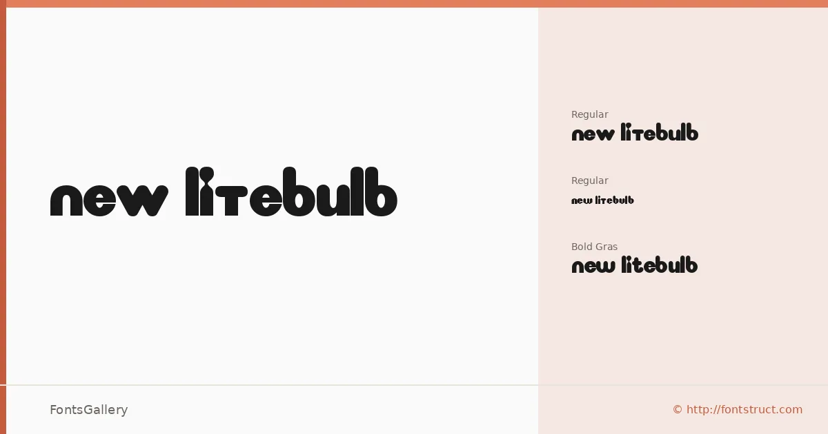
About New LiteBulb Font
There is something deliberately playful about the way these letterforms behave — constructed with a geometric, almost pixel-lit logic that feels like a sign glowing at the edge of an arcade. Created by LDEJRuff using FontStruct, the family carries the character of a display face built for impact rather than extended reading. The copyright belongs to DLE Fonts, with trademark held by Nick.
Design Aesthetics & Character Characteristics
New LiteBulb is a display family that leans boldly into the whimsical and modern end of the spectrum. It ships as three TTF cuts — a Regular Normal, a Regular labeled Arcade, and a Bold — each nudging the same core aesthetic in a slightly different direction. The Arcade variant has a retro cabinet energy, while the Bold version leans into branding weight, and together they give the family enough range to move between lighthearted and emphatic without losing their identity.
Recommended Usage & Font Pairing
The family earns its place in headlines, posters, logos, and T-shirt design — anywhere Latin-script copy needs to stop a viewer rather than guide them through a paragraph. It pairs well against the clean rationalism of Bahnschrift or Helvetica, the editorial warmth of Canela or Etna, and the authoritative contrast of Times New Roman, any of which can anchor body copy while this family holds the top of the hierarchy.
License & Usage Terms
The family is available for commercial use under a Creative Commons Attribution Share Alike license — confirm attribution and share-alike requirements before deploying. TTF files are embedded with editable permissions.