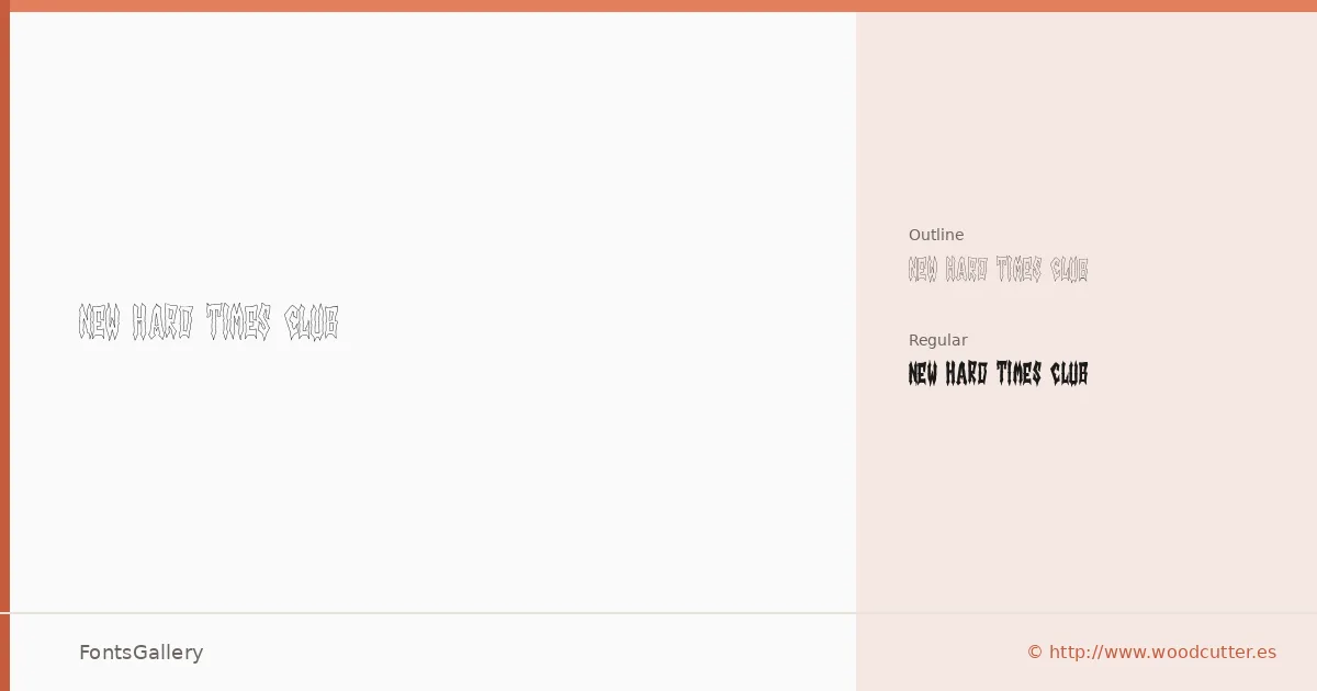
About New Hard Times Club Font
There is grit in the letterforms here — the kind that comes from worn woodblock type and ink that never quite sat flat on the page. New Hard Times Club comes from Woodcutter Manero, the Spain-based type designer behind the woodcutter.es library, released in 2025. The family arrives in two cuts: a solid Regular and a companion Outline, both in OTF format, and together they give you the full visual range of the style.
Design Aesthetics & Character Characteristics
This is display type built around grunge, rustic texture, and a vintage weight that reads as confident rather than decorative. The Regular carries the full mass of the letterforms, while the Outline version strips the fill away to let backgrounds breathe through the shapes — a useful contrast when layering or reversing out on dark stock. Both cuts cover the Latin script. The mood is unapologetically bold, closer to a concert handbill or a whiskey label than to a corporate heading.
Recommended Usage & Font Pairing
The design lends itself naturally to poster headlines, branding marks, logo lockups, magazine covers, and T-shirt graphics — anywhere a rough, hand-pressed feeling adds character rather than noise. For contrast pairing, the listed companions span a wide tonal range: the warmth of Etna or Canela can soften the surrounding text, while Helvetica or Bahnschrift bring a clean, rational counterpoint that makes the display weight hit harder. ABC Arizona splits the difference with a contemporary editorial sensibility.
License & Usage Terms
This family is released under Personal Use terms — commercial use is not permitted, so confirm licensing before taking it into a paid job by contacting Woodcutter Manero directly at [email protected] or through http://www.woodcutter.es.