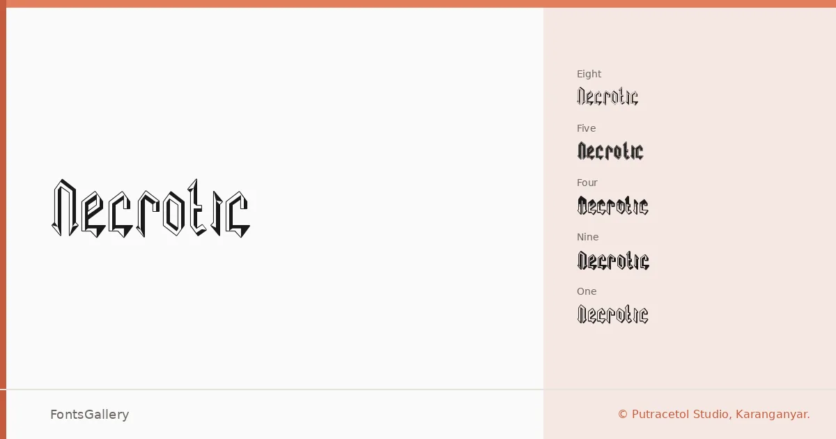
About Necrotic Font
There is real weight in these letterforms — the kind of deliberate, gothic density that blackletter achieves when drawn with conviction rather than nostalgia. Putra Novembria Candra Kusuma of Putracetol Studio in Karanganyar built this family as a set of ten distinct stylistic variants: Regular One through Regular Nine, plus a core Regular, each offering its own interpretation of the underlying blackletter structure. The differences between cuts are meant to give you genuine choice across a range of applications rather than superficial variation.
Design Aesthetics & Character Characteristics
The mood sits firmly at the intersection of grunge and classic — think aged ink, heavy strokes, and the kind of vintage authority that blackletter carries when it isn't overwrought. Across all ten styles the Latin character set is handled with consistency, so the family reads as a coherent system even as individual cuts diverge in texture or weight detail. Delivered as TTF files, the forms hold up well at display sizes where the stroke contrast and period detailing do their best work.
Recommended Usage & Font Pairing
This family earns its place in branding, logo work, poster design, magazine headlines, and apparel graphics — anywhere a bold, gothic voice needs to anchor a layout without apology. For contrast pairings, the family has been matched well against clean, neutral companions such as Helvetica and Bahnschrift, and against higher-contrast or editorial faces like Etna, Canela, and ABC Arizona, all of which let the blackletter character lead while keeping body copy legible.
License & Usage Terms
Necrotic is offered under a Personal Use license — commercial use is not permitted under the standard terms, so confirm your use case before taking it into a paid project and contact the creator directly at Putracetol Studio for an extended license; full terms are at https://putracetol.com/licenses/.