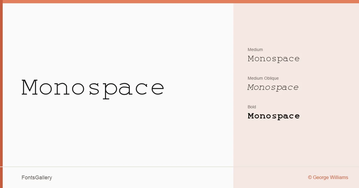
About Monospace Font
Every character in a well-made monospaced face earns its fixed column width — and this family, drawn by George Williams, holds up to that standard with a clean, upright posture and consistent stroke weight that gives running text a steady, mechanical rhythm. The copyright traces the spline programs back to 2000–2001, making this a considered piece of work rather than a quick conversion.
Design Aesthetics & Character Characteristics
The family sits in classic monospace territory but reads as modern and minimal rather than retro-terminal: forms stay professional without the nostalgic quirks that can date a typeface. Three styles are available — Medium Regular, Medium Oblique, and Bold Bold — covering the core weight-and-style combinations most layout and code-adjacent work demands. The fixed-width geometry keeps spacing predictable, which pays dividends in anything tabular or systematically structured. Script coverage is notably broad for a monospace face, reaching Latin, Latin Extended (partial), Vietnamese, Cyrillic, Greek, Coptic (partial), Hebrew, and Katakana — all delivered in TTF format with installable embedding permission.
Recommended Usage & Font Pairing
The professional, minimal tone makes it a natural fit for branding systems, logo wordmarks, magazine folios, presentation decks, and website headers where structured rhythm signals precision. The multilingual range means a single family can carry through projects that move across Latin, Greek, Cyrillic, Hebrew, or Japanese Katakana contexts without substitution breaks. For pairing, the face works alongside Helvetica for a neutral sans companion, or alongside Aresink, Alexandria, Bizantheum, and Audex when the project calls for more expressive contrast.
License & Usage Terms
Released under the SIL Open Font License, which permits commercial use — you can deploy it freely in client and commercial work. Embedding is set to installable, so documents distributed in PDF or other formats carry the font without restriction.