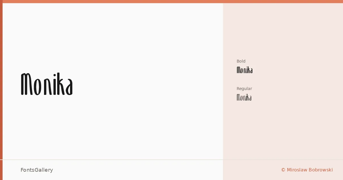
About Monika Font
There is a deliberate formality to these letterforms — the kind that comes from a designer who understood the difference between elegance and decoration. Miroslaw Bobrowski drew this display family with a classic sensibility, keeping the forms controlled and legible even at the sizes where display type tends to come apart. The family ships as two cuts: Monika at Normal weight and Monika Bold, both in TTF format.
Design Aesthetics & Character Characteristics
The mood here sits squarely in vintage and elegant territory, which in practice means the characters carry enough historical resonance to feel authoritative without tipping into costume. As a display category face, it is built for scale — the details read best when given room to breathe in a headline or logotype setting. The two weights give you a working range without overcomplicating the palette, and the Latin coverage is clean throughout both cuts.
Recommended Usage & Font Pairing
Branding, logo work, magazine headlines, and poster composition are the natural homes for this family, and it holds up equally well as a website header where a touch of vintage character is the point rather than an accident. For body text or supporting type, it pairs well with the neutrality of Helvetica or Bahnschrift, and works alongside the more contemporary display sensibilities of Canela or Etna. AQUA is also a listed pairing for moments when the surrounding context calls for something with stronger contrast.
License & Usage Terms
This family is available for commercial use, with embedding set to editable — meaning you can embed it in documents that others can edit.