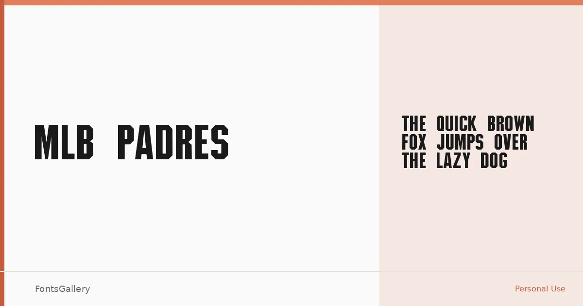
About MLB Padres Font
There is something immediately recognizable about the weight and swagger of ballpark lettering — the kind of type that has been painted on dugout walls and stitched onto jerseys for generations. MLB Padres carries that same presence: a single Regular cut built in the display tradition, with a bold, vintage character that reads as both athletic and authoritative. The file was generated by Fontographer 4.1, which places it firmly in a classic era of type production.
Design Aesthetics & Character Characteristics
This is a display face through and through — loud enough for a headline, confident enough for a logo. The mood sits at the intersection of bold and professional, with a vintage quality that gives it earned gravitas rather than manufactured nostalgia. Available as a single Regular style in TTF format, it is not a workhorse family built for running text; it is a face designed to anchor a composition and hold its ground at large sizes.
Recommended Usage & Font Pairing
The natural home for this face is anywhere that demands immediate visual authority: branding systems, signage, headline treatments, logo lockups, and T-shirt design all suit its proportions well. For contrast in a layout, the clean geometry of Helvetica or Abrade would give surrounding text room to breathe, while more editorial companions like Canela or ABC Arizona introduce a tonal shift that keeps the vintage weight from dominating everything. (AH) Manal offers a useful alternative for contexts that call for a warmer counterpoint.
License & Usage Terms
This family is available under Personal Use terms only — confirm licensing with the rights holder before committing it to any commercial job. Embedding is restricted, so account for that early if the file needs to travel inside a PDF or application.