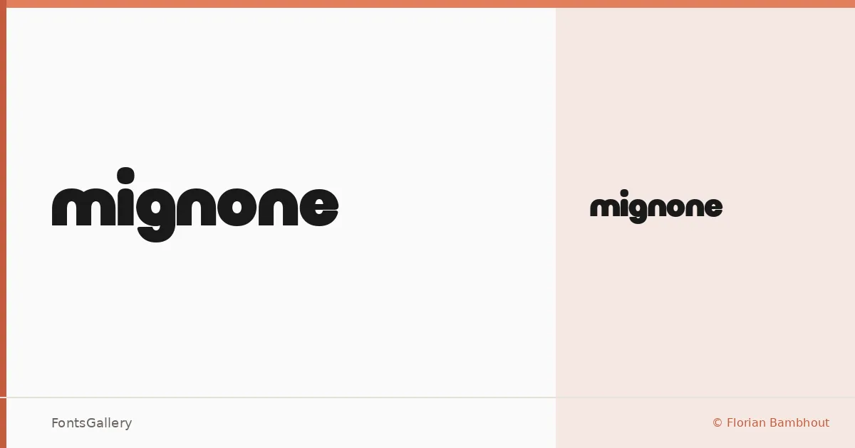
About Mignone Font
There is a deliberate tension in this display face — minimal in its construction, yet bold enough to hold a poster at distance. Florian Bambhout of Bambootypes drew it with a single weight, Regular, which makes every decision in the letterforms count. The result is a Latin-script typeface that feels considered rather than overworked.
Design Aesthetics & Character Characteristics
Sitting squarely in the display category, the design leans into a modern, playful sensibility without losing the discipline that keeps branding work clean. Because there is only one cut — Regular — the face earns its weight through proportion and spacing rather than through a sprawling style range. It arrives as a TTF file, straightforward to install and use.
Recommended Usage & Font Pairing
The bold, minimal character makes it a natural fit for headlines, logos, posters, and social media graphics where a single word or short phrase needs to carry the frame. For longer supporting text or complementary settings, the listed pairing options — Etna, Canela, Helvetica, AQUA, and Bahnschrift — offer a range of moods from editorial warmth to strict neutrality, giving you room to dial the surrounding tone up or down.
License & Usage Terms
Mignone is released under Personal Use terms as freeware — commercial use is not permitted, so confirm clearance with Florian Bambhout at bambootypes.com before taking it into a paid project. The font is licensed with installable embedding permission.