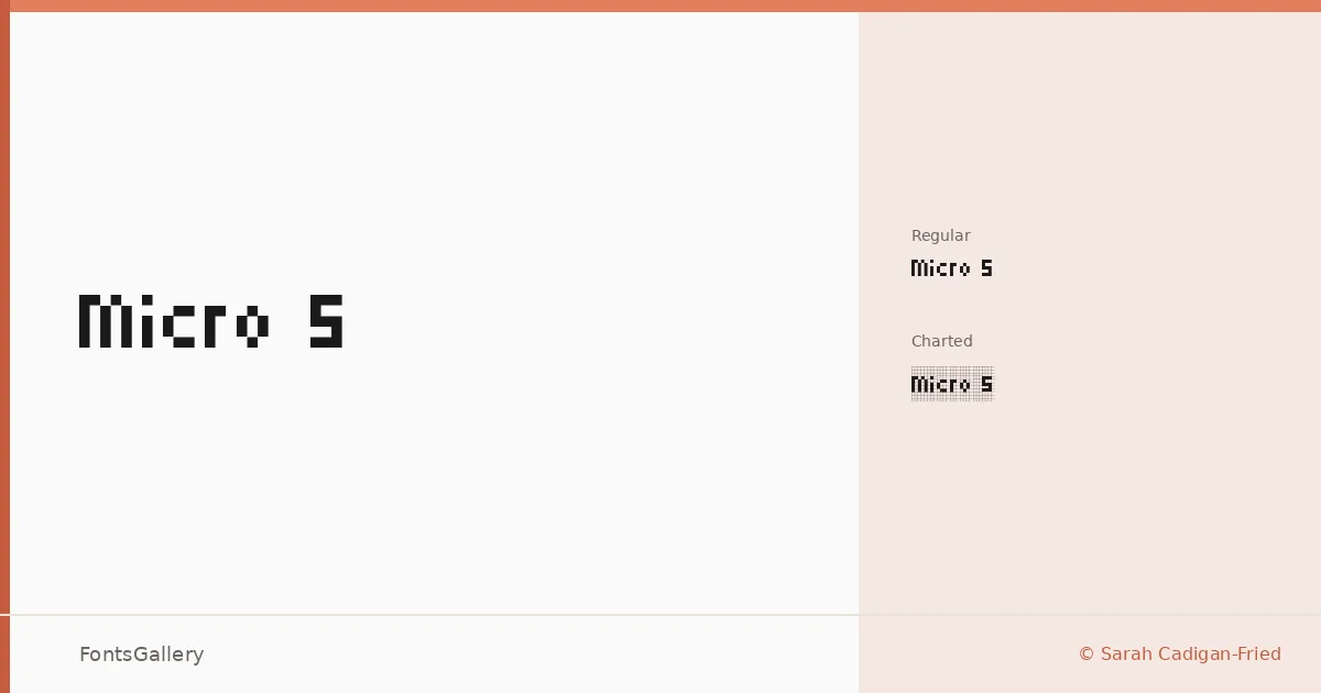
About Micro 5 Font
There is something immediately recognizable about this face — the tight pixel grid of early digital displays, reconstructed as a clean vector letterform. Sarah Cadigan-Fried built it under the Soft Type Project, and the result sits at an interesting crossroads between retro screen culture and something genuinely fresh. The two cuts in the family are Micro 5 Regular and Micro 5 Charted Regular, the latter adding a visible grid or chart structure to the underlying geometry.
Design Aesthetics & Character Characteristics
This is a Display family that leans into the futuristic and the playful without abandoning a certain vintage sincerity — the kind of type that reads like an arcade cabinet and a tech startup moodboard at the same time. Both styles are available as TTF files and cover the Latin script. At larger sizes the pixel-derived construction is the whole point: counters are tight, strokes resolve into deliberate rectangular segments, and spacing feels calibrated for headlines rather than running text.
Recommended Usage & Font Pairing
The obvious calls are branding, poster work, logo lockups, and social media graphics where a bold, character-driven display face earns its keep fast; it also translates well to T-shirt design, where the retro-digital mood prints cleanly. For contrast pairings, the neutrality of Helvetica or Asap in body copy gives it room to breathe, while Canela, Etna, or ABC Arizona each offer a very different tonal counterpoint — editorial softness or geometric warmth against the hard pixel grid.
License & Usage Terms
This family is released under the SIL Open Font License, Version 1.1 — personal-use terms apply, so confirm clearance at openfontlicense.org before committing it to a commercial job. Embedding is set to installable.