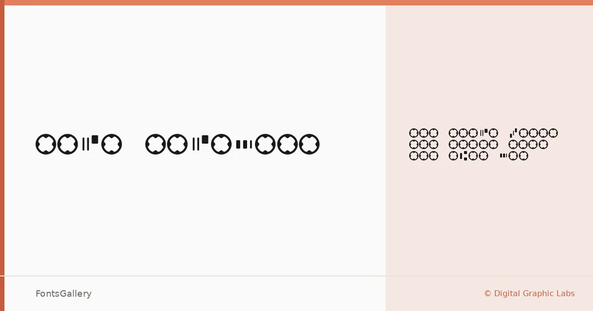
About MICR Encoding Font
The characters here are unmistakable — those squat, ink-trap-ready glyphs designed for magnetic ink character recognition, translated into a digital TTF by Digital Graphic Labs. Every letterform carries the deliberate geometry of a system built for machine reading, which gives the face a cool, almost clinical precision that reads as thoroughly contemporary in a design context.
Design Aesthetics & Character Characteristics
This is a monospace family, available in a single Regular weight, and the spacing discipline that comes with fixed-width setting is central to its character. The forms feel minimal and modern — stripped of ornament, governed by function — which is exactly what makes them striking when pulled out of their original banking context and put to work in branding or editorial environments. Latin script is supported throughout.
Recommended Usage & Font Pairing
The face earns its place on business cards and certificates where a sense of institutional authority is wanted, and it holds its own in presentations that need a professional, systematic edge. Its rigid rhythm also gives branding work a technological signal that softer faces cannot deliver as efficiently. It pairs well with Helvetica for clean, neutral compositions, and the contrast against more expressive faces like Aresink, Alexandria, Bizantheum, or Audex can be particularly effective when you want the structured rigidity of this face to anchor something more fluid.
License & Usage Terms
This family is available for commercial use, and embedding is permitted at the installable level, so it can be distributed inside documents and applications without restriction beyond the license terms.