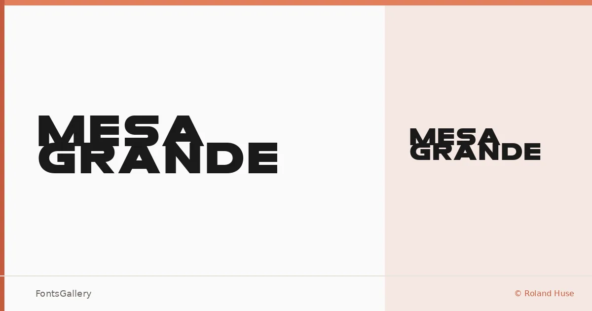
About Mesa Grande Font
Roland Huse built this display face with a boldness that reads from across a room — the kind of weight that earns its space on a headline or a storefront. The family ships as a single Regular cut in TTF format, which means what you see is deliberate: one strong, considered voice rather than a range of variations diluting the impact.
Design Aesthetics & Character Characteristics
It sits squarely in the display category, carrying a modern and professional character that leans into confidence without tipping into aggression. The forms feel constructed for Latin text at large sizes — tight, purposeful, and at home wherever a design needs a clear focal point. That single Regular style is all you get, so the weight and spacing do the heavy lifting that a full family might spread across multiple cuts.
Recommended Usage & Font Pairing
The obvious territory is branding, poster work, logo lockups, and headline settings where a bold display face sets the tone immediately — it also handles t-shirt graphics well, where legibility at scale matters more than texture at small sizes. For text underneath, the named pairings worth considering are Canela for something editorial and warm, Helvetica or Bahnschrift for a clean neutral contrast, Etna if you want to stay in a similarly strong register, or ABC Arizona when the project calls for a more refined companion.
License & Usage Terms
Mesa Grande is available under personal-use terms — commercial projects require a donation to the designer, so confirm that arrangement before taking it into a client job. Embedding is limited to preview and print only.