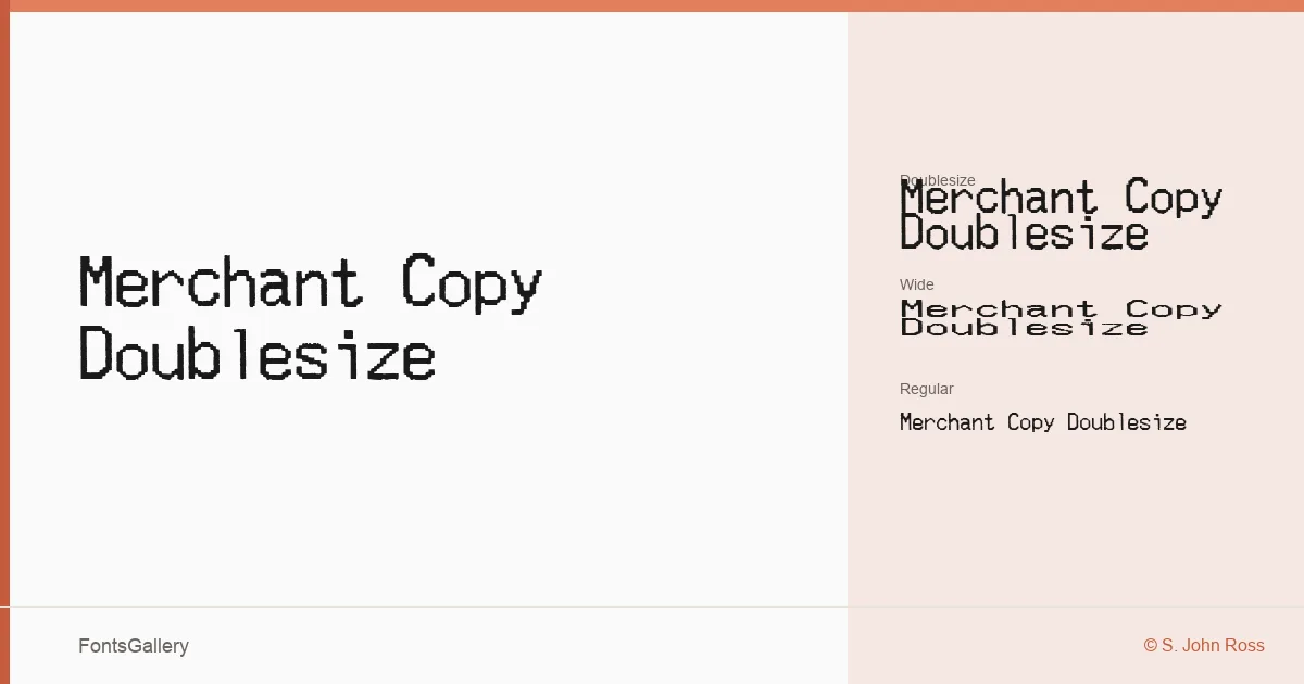
About Merchant Copy Doublesize Font
The dot-matrix grain of a point-of-sale receipt is exactly what S. John Ross set out to capture here — and he did so from actual sample scans, commissioned and completed in 2006. The result is a monospace family that reads less like a designed typeface and more like thermal paper pulled from a register drawer: every character carrying that familiar, slightly ragged dot-grid presence.
Design Aesthetics & Character Characteristics
Three cuts make up the family — Regular, Wide, and Doublesize — each one a different physical proportion of the same receipt-machine DNA. The mood is decidedly bold, grunge-edged, and vintage without being decorative about it; the rustic quality comes from the source material itself rather than any applied distress. In text, the monospace spacing reinforces the machine-origin feel, keeping every line tight and evenly mechanical. The family ships as TTF files.
Recommended Usage & Font Pairing
The best jobs for this family are ones that need authenticity over polish: poster headlines, packaging that leans into retro or industrial references, branding with a raw edge, advertisement copy that wants to feel analog, and T-shirt design where the worn, receipt-printed look is the point. It pairs well with the clean geometry of Helvetica when you want contrast, or with Aresink, Alexandria, Bizantheum, and Audex when you're building something that stays in the same gritty register throughout.
License & Usage Terms
This family is released under Personal Use terms — commercial use is not permitted, so confirm licensing directly with S. John Ross at cumberlandgames.com before placing it in any commercial job. Embedding is restricted.