About Mechanical Font
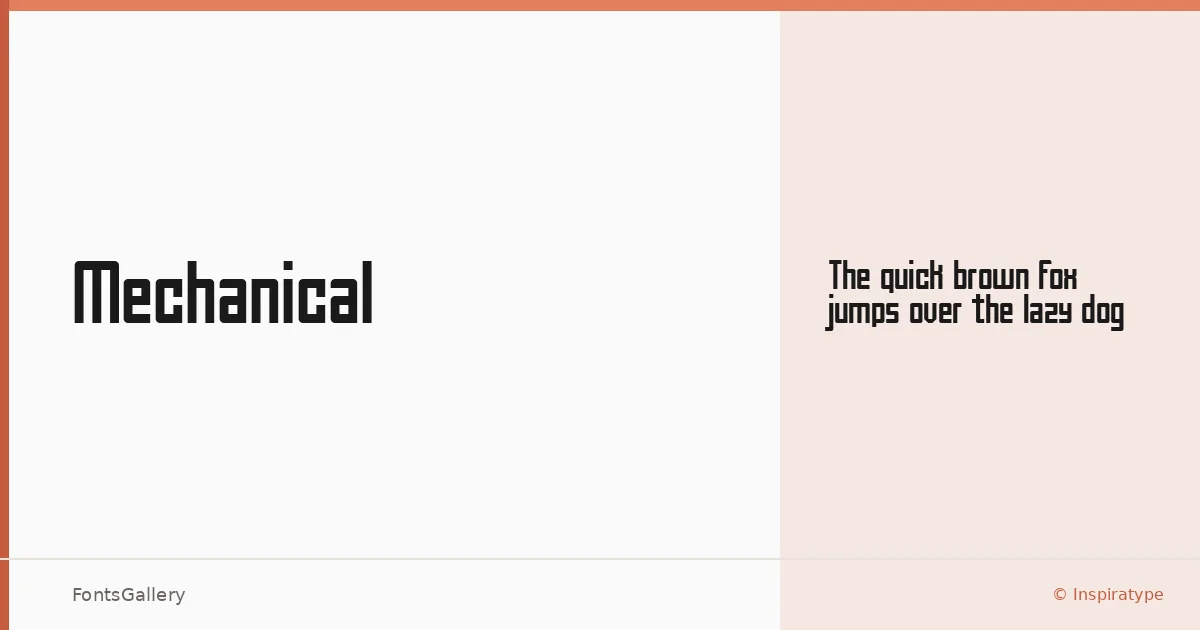
There is a deliberate hardness to the letterforms here — sharp terminals, rigid geometry, and a constructed quality that reads less like calligraphy and more like engineering. This single-cut display face comes from Inspiratype and is available in Regular, delivered in both TTF and OTF formats.
Design Aesthetics & Character Characteristics
The category is Display, and the design leans into that fully: bold, futuristic, and modern in a way that feels intentional rather than ornamental. Strokes carry a professional weight without softening into approachability — this is a face built for impact at large sizes. The geometry is tight and systematic, giving headlines and logotypes a structured, almost industrial presence.
Recommended Usage & Font Pairing
It earns its keep in branding, poster work, logo lockups, and T-shirt design — anywhere a headline needs to command the frame without relying on flourish. For body copy or supporting text, it pairs well with the clean neutrality of Helvetica or Josefin Sans, while Canela, Asap, or ABC Arizona can introduce contrast through warmth or editorial softness when the layout calls for it.
License & Usage Terms
This family is released under a Personal Use license, which means commercial use is not permitted — confirm licensing terms with Inspiratype before applying it to any client or revenue-generating work. Embedding is limited to preview and print only.