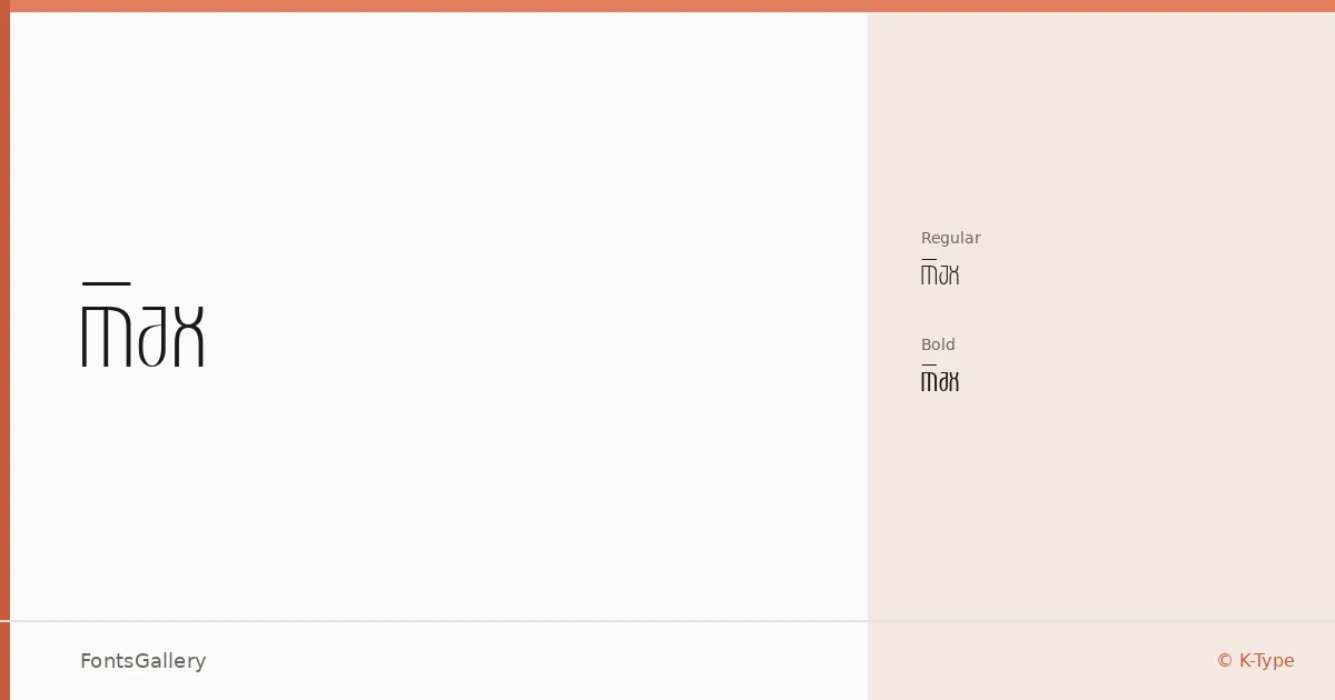
About Max Font
There is an unapologetic weight to these letterforms — a compressed, geometric confidence that locks into place whether set large or larger. The family was designed by Keith Bates of K-Type, and it arrives in two cuts: Regular and Bold. Both are delivered as TTF files.
Design Aesthetics & Character Characteristics
This is a display face that leans hard into the modern and the minimal. Strokes are controlled, proportions are tight, and any ornament that might soften the impact has been stripped away — the result reads as futuristic without chasing novelty. The step from Regular to Bold is a meaningful one, giving you a range that works across headline hierarchies without needing extra weights in between.
Recommended Usage & Font Pairing
The natural home for this family is wherever a headline needs to hold its ground: posters, branding systems, logo lockups, and website headers that have to read before anything else on the page does. Latin coverage handles those contexts well. When you need a contrasting body or secondary face, it sits comfortably alongside Helvetica or Bahnschrift for a clean sans-on-sans pairing, and opens up nicely against the editorial softness of Canela or the classic authority of Times New Roman — Etna is another option worth testing in mixed-weight layouts.
License & Usage Terms
This family is released under Personal Use terms, which means commercial use is not permitted — confirm licensing directly with K-Type before deploying it in any paid or client-facing work. Embedding is set to installable.