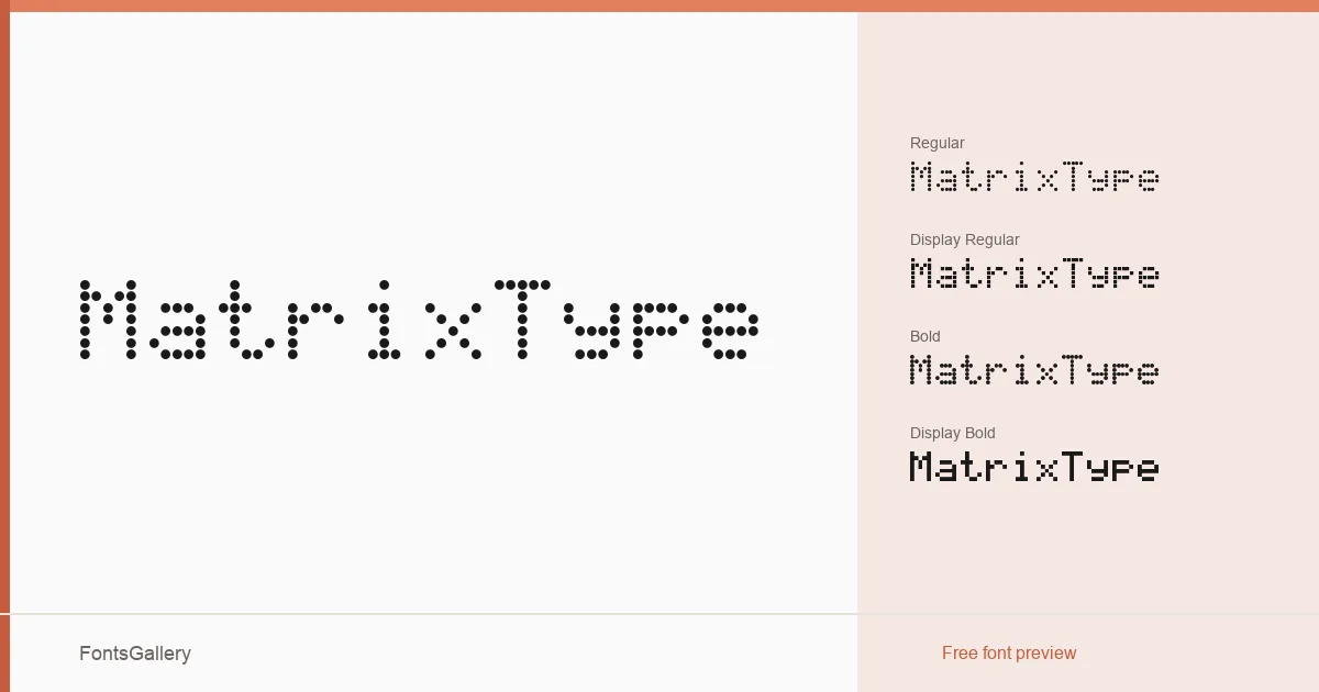
About MatrixType Font
There is something deliberately fractured about these letterforms — a grid-based tension that reads as both digital decay and structured authority. GGBotNet built this family around a matrix aesthetic that sits comfortably between grunge and hard-edged modernism, with four distinct cuts: Regular and Bold in the standard weight, and Regular and Bold in a Display variant tuned for larger scales.
Design Aesthetics & Character Characteristics
This is a Display category family with a futuristic, bold character that leans into rough edges without losing legibility at headline sizes. The Display cuts push the expressive qualities further, making them the natural choice when impact is the brief. All four styles ship in both TTF and OTF formats, and the family covers Latin — partial — alongside Arabic, giving it reach across two script systems. The letterforms carry an industrial weight that feels at home in motion graphics as much as print.
Recommended Usage & Font Pairing
Branding decks, poster campaigns, logo lockups, and T-shirt graphics are where these cuts earn their keep — anywhere the design needs a sharp, unapologetic voice. The partial Latin and Arabic coverage makes it worth checking character sets carefully before committing to a multilingual project. For body copy or supporting text, it pairs well with clean companions like Helvetica or Alexandria, and the pairing names Aresink, Bizantheum, and Audex are worth exploring when the overall direction calls for something with more personality alongside it.
License & Usage Terms
Released under Creative Commons Zero v1.0 Universal — effectively Public Domain — which allows commercial use without restriction, and the embedding permission is set to installable.