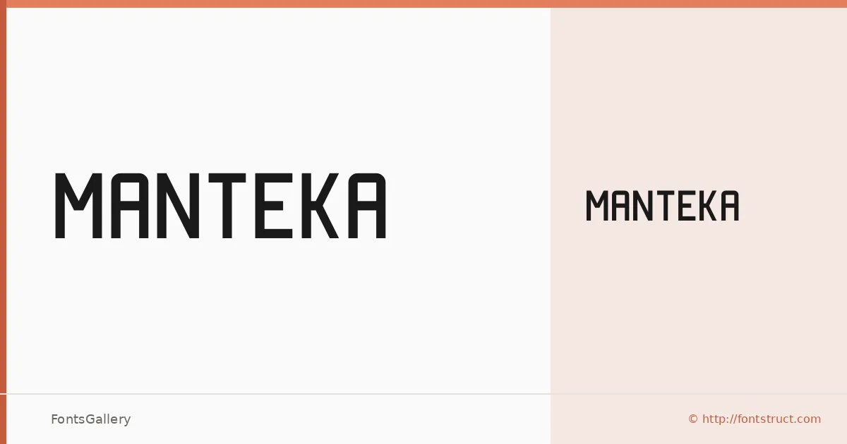
About Manteka Font
There is a deliberate geometric tension in these letterforms — each character carries a futuristic rigidity that feels constructed rather than drawn, which makes sense given that beynon built it using FontStruct. The single Regular weight is available as an OTF file, and it holds together with a stripped-back minimalism that rewards display-scale use.
Design Aesthetics & Character Characteristics
This is a display face with a bold, modern sensibility — the kind of type that reads as a decision rather than a default. The forms lean minimal and structural, with a futuristic quality that sits comfortably between industrial geometry and clean contemporary design. At headline sizes, the letterforms assert themselves without ornamentation; they simply hold their ground.
Recommended Usage & Font Pairing
It earns its place in branding, logo work, poster headlines, and signage — anywhere that a single strong weight needs to carry the visual load. For contrast in a layout, the listed pairings worth exploring are Canela for warmth, Times New Roman for classical counterpoint, Helvetica or Bahnschrift for a neutral sans companion, and Etna when you want something with its own distinct character beneath the headline.
License & Usage Terms
Manteka is released under Personal Use terms as a Creative Commons Attribution Non-commercial No Derivatives license — confirm with the rights holder before any commercial job, and note that embedding is permitted for preview and print only.