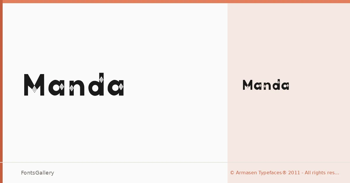
About Manda Font
There is a deliberate restraint to this display face — strokes that carry weight without shouting, letterforms that sit with confidence rather than aggression. It comes from Armasen Typefaces® and arrives as a single Regular cut, which is itself a statement: one precise setting, no hedging across a range of weights.
Design Aesthetics & Character Characteristics
It sits in display territory with a minimal, modern sensibility — the kind of professional boldness that reads immediately at large sizes without collapsing into decoration. The single Regular style keeps things focused, and the TTF file will drop cleanly into most design workflows. The overall mood lands somewhere between editorial sharpness and brand-ready clarity.
Recommended Usage & Font Pairing
This is a face built for headlines, posters, magazine covers, and logo lockups — anywhere the type needs to carry the room at scale. It pairs well with the quiet geometry of Helvetica or Bahnschrift for body text, and sits interestingly alongside Canela when you want contrast between sharp and soft. Etna and AQUA are worth exploring in layouts where display faces share the page as complementary elements rather than competitors.
License & Usage Terms
Manda is available under a Personal Use license, which means commercial use is not permitted — confirm licensing terms with Armasen Typefaces® before deploying it in any client or revenue-generating work. Embedding is limited to preview and print only.