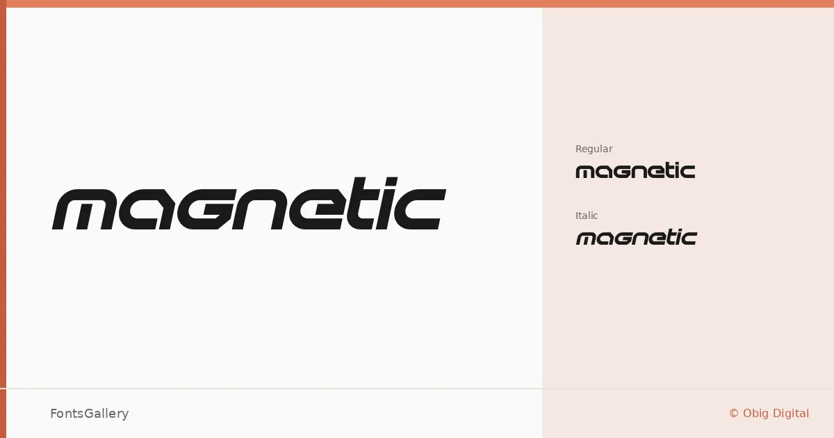
About Magnetic Font
There is a taut, forward-leaning energy to these letterforms — a confidence that makes them want to occupy space rather than simply fill it. Designed by Abu Hasnat at Obig Digital, the family arrives in two cuts: a Regular upright and a Regular Italic, both in TTF format.
Design Aesthetics & Character Characteristics
This is a display face built around a futuristic, modern sensibility with a professional edge. The forms read as bold even at their standard weight — there is nothing tentative about the construction. The italic leans into that momentum further, giving you a companion that shifts tone without breaking the overall character of the family. Together, the two styles carry the kind of visual authority that headline and poster contexts demand.
Recommended Usage & Font Pairing
The natural home for these cuts is anywhere a single line of type needs to carry the room: brand wordmarks, logo lockups, poster headlines, and T-shirt graphics all sit squarely in its range. For body copy or supporting text, it pairs well with the neutrality of Helvetica or the warmth of Asap, while editorial pairings with Canela, ABC Arizona, or Etna introduce useful contrast in weight and personality.
License & Usage Terms
This family is released under a Personal Use license — commercial use is not permitted under the standard terms, so confirm clearance before any client or paid work by contacting [email protected]. Embedding is limited to preview and print only.