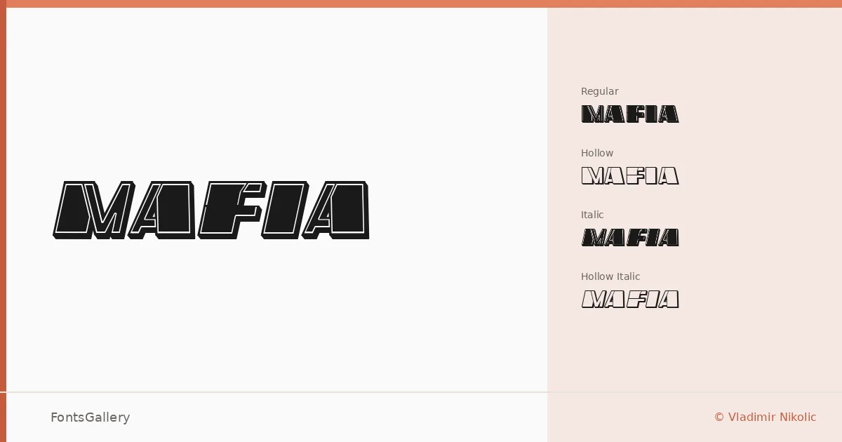
About Mafia Font
There is a deliberate tension in these letterforms — something between a vintage hand-lettered signboard and a modern grunge aesthetic that makes them feel charged without trying too hard. Designed by Vladimir Nikolic, the family arrives in four cuts: Regular, Italic, Hollow Regular, and Hollow Italic. The hollow variants open the strokes up to a traced outline, giving the set real range for layering and contrast work.
Design Aesthetics & Character Characteristics
This is a display family that leans into bold, grunge-inflected character — rough at the edges without losing legibility at headline scale. The italic cuts carry momentum and attitude, while the hollow versions soften the weight and introduce a more editorial, almost stencil-like quality. Delivered in TTF format, the four styles sit together in a mood that feels simultaneously vintage and sharply modern — the kind of texture you reach for when clean neutrality would be the wrong call.
Recommended Usage & Font Pairing
The family is built for high-impact display work: posters, logo lockups, branding identities, and t-shirt graphics where the type needs to carry attitude on its own. For contrast pairings, the listed companions — Helvetica, Josefin Sans, and Asap — offer clean, rational counterweights, while Canela and ABC Arizona bring editorial warmth that can ground the grunge energy in a more refined layout.
License & Usage Terms
This family is released under Personal Use terms, and commercial use is not permitted — confirm licensing directly with Vladimir Nikolic before placing it in any client or revenue-generating work. Embedding is limited to preview and print only.