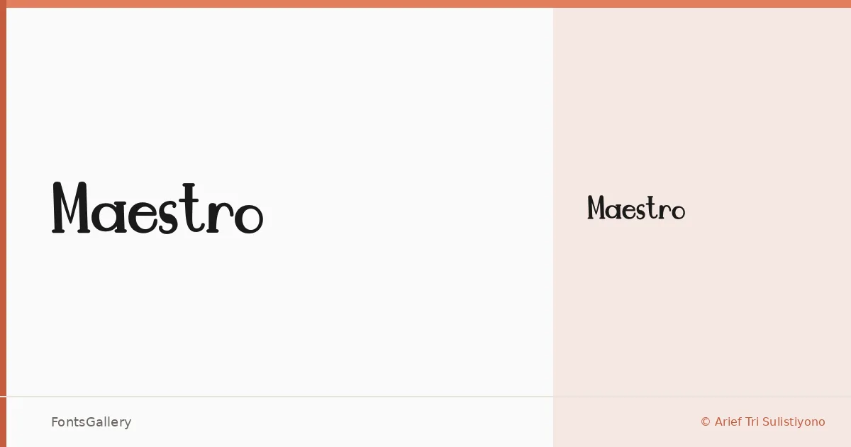
About Maestro Font
There is a certain theatrical confidence to the letterforms here — the kind of calligraphic swing that sits somewhere between a broadnib pen and a showbill compositor's instinct. Arief Tri Sulistiyono drew these characters under the Supersemar Letter trademark, and the result carries a genuinely vintage elegance without feeling like pastiche. The single Regular cut is delivered as a TTF, built in FontCreator 11.5.
Design Aesthetics & Character Characteristics
This is a display face in the classic, elegant tradition — the kind of script-adjacent lettering that reads as both playful and ceremonial depending on what sits around it. Because there is only the one weight, every application comes down to size, spacing, and contrast with supporting type. At large sizes the strokes reward attention; at small sizes the intricacy gets lost, so headline and display settings are where it belongs. Latin character coverage handles standard Western European copy.
Recommended Usage & Font Pairing
The face is built for logo lockups, poster headlines, magazine mastheads, and branding moments where a touch of vintage drama earns its place. For body copy or secondary text, the listed pairing options cover a wide tonal range: Helvetica and Bahnschrift bring clean geometric neutrality that keeps the display lettering in charge, while Times New Roman and Canela add their own editorial warmth without competing, and Etna offers a structurally sympathetic companion for more decorative layouts.
License & Usage Terms
Maestro is offered under Personal Use terms only — commercial use is not permitted, so confirm clearance with the rights holder before applying it to any client or revenue-generating work. Embedding is restricted under the current license.