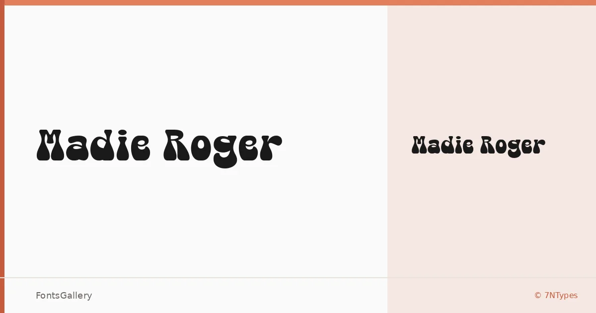
About Madie Roger Font
There is something immediately tactile about this display face from Situjuh Nazara of 7NTypes — the letterforms carry a worn, handcrafted quality that reads as both bold and a little rough around the edges, in exactly the right way. It arrives as a single Regular cut in OTF format, which keeps the proposition clear and focused.
Design Aesthetics & Character Characteristics
Sitting squarely in the display category, the design leans into a rustic, vintage sensibility without feeling like a museum piece — there is enough playful energy in the strokes to keep things lively. The weight is confident, the texture is deliberate, and the Latin character set holds together well at large sizes where these kinds of details reward a closer look. It is the kind of face that works hardest when given room to breathe.
Recommended Usage & Font Pairing
Its natural territory is anywhere a strong visual identity needs a headline with personality — branding, logo lockups, poster work, social media graphics, and t-shirt design are all well within its range. For contrast, the neutrality of Bahnschrift or Helvetica grounds it cleanly, while Canela or Times New Roman bring an editorial softness that plays nicely against the rougher texture. Etna offers another display-weight option if you want to build a more layered typographic system.
License & Usage Terms
Madie Roger is available under Personal Use terms, which means commercial use is not permitted — confirm licensing directly with 7NTypes at http://7ntypes.com before applying it to any client or commercial work.