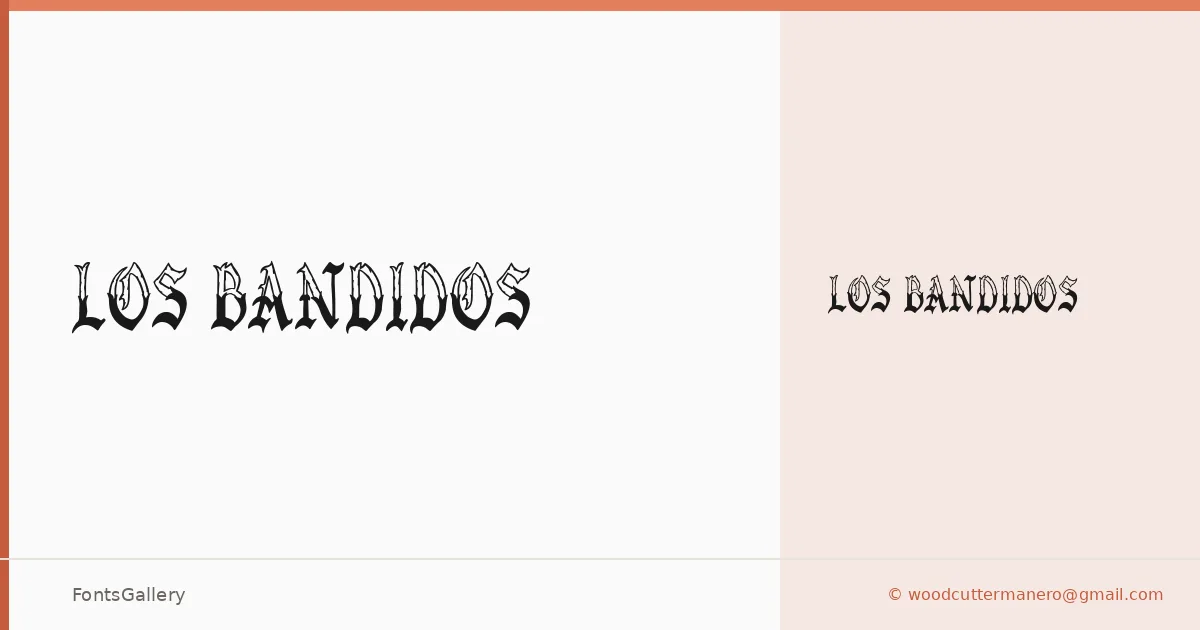
About Los Bandidos Font
There is real weight and menace in these letterforms — the kind of blackletter that feels like it was carved rather than drawn, with rough edges that carry the grain of the woodcut tradition. This is a single Regular cut from Woodcutter Manero, whose copyright dates it to 2024, and it arrives as a TTF built for display work where attitude matters more than finesse.
Design Aesthetics & Character Characteristics
The category is Blackletter, but the sensibility is grunge and rustic rather than ecclesiastical — this is not a typeface for illuminated manuscripts. The forms lean into vintage irregularity, with strokes that suggest wear, pressure, and hand-production. Because there is only the one Regular weight, all the drama lives in the letterforms themselves, not in contrast between cuts, which means composition and scale do the heavy lifting.
Recommended Usage & Font Pairing
It earns its keep in branding, poster work, signage, logo lockups, and t-shirt design — anywhere a bold, raw Latin-script headline needs to command space without apology. For contrast pairings, clean and rational faces hold it well: Helvetica and Bahnschrift give a stark modern foil, while Canela or ABC Arizona introduce a softer editorial tension. Etna, sharing some of that graphic energy, sits closer in character and works when you want the body to echo rather than recede.
License & Usage Terms
Los Bandidos is released under Personal Use terms — commercial use is not permitted, so confirm clearance with the designer at [email protected] or via woodcutter.es before taking it into any paid job.