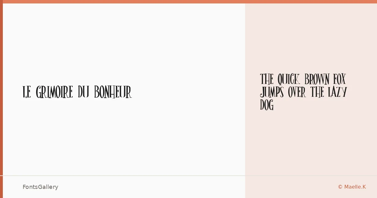
About Le Grimoire du Bonheur Font
There is something almost ceremonial about these letterforms — the kind of deliberate, ornate quality you find in old illuminated manuscripts or the title pages of nineteenth-century volumes. Le Grimoire du Bonheur is a single-weight display face from designer Maelle Keita, released under the Maelle.K foundry, offered here as a Regular cut in TTF format.
Design Aesthetics & Character Characteristics
The family sits firmly in the display category, drawing on a classic, elegant, and vintage sensibility that leans into luxury without becoming garish. With only the one Regular weight available, it asks you to let the letterforms do the heavy lifting — and they do, carrying the kind of refined drama that works at large sizes where every curve and terminal can be appreciated. Latin character coverage keeps it focused and clean.
Recommended Usage & Font Pairing
This is a face built for moments that need presence: book covers, poster headlines, editorial mastheads, logo lockups, and high-end branding where the type itself signals quality. At smaller supporting sizes, it pairs naturally with the rational clarity of Helvetica or Josefin Sans, the editorial warmth of Canela or ABC Arizona, and the readable neutrality of Asap — any of which can ground the decorative energy of the display without fighting it.
License & Usage Terms
This family is released under a Personal Use license — commercial use is not permitted, so confirm licensing with the designer before applying it to any client or revenue-generating work. Embedding is limited to preview and print only.