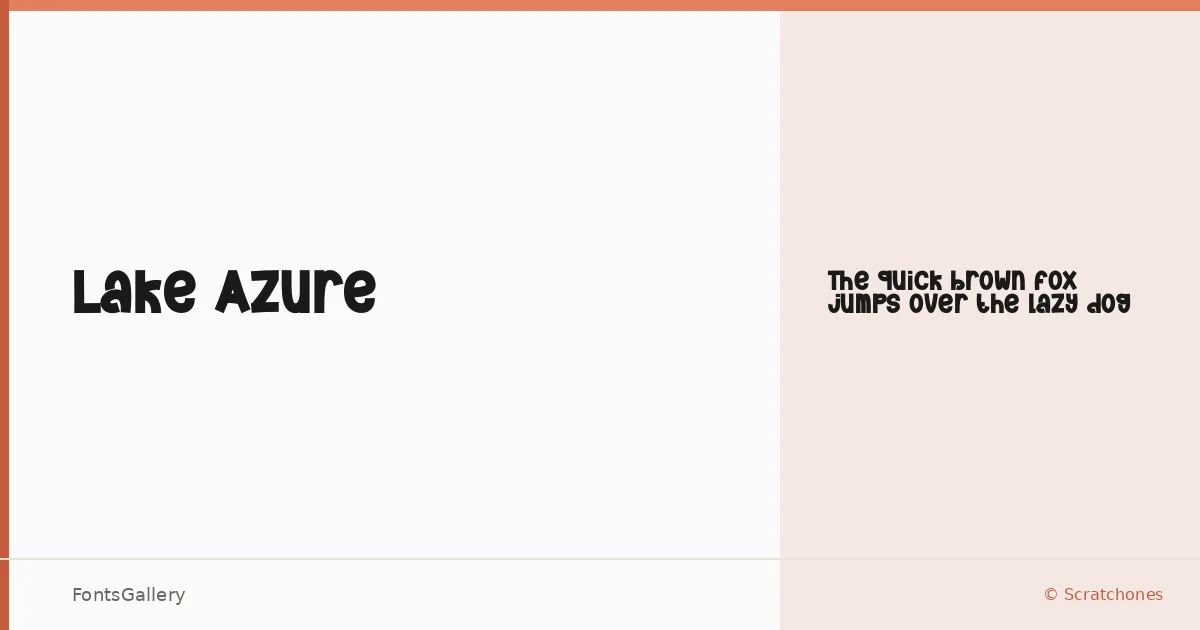
About Lake Azure Font
There is something immediately playful about this display face — the kind of letterforms that lean into character without tipping into chaos. Designed by Scratchones, Lake Azure arrives as a single Regular weight, delivered in OTF format, built for moments where personality is the whole point.
Design Aesthetics & Character Characteristics
It sits squarely in the display category, carrying a mood that is simultaneously bold and whimsical — modern in its confidence but light enough in spirit to avoid feeling heavy-handed. The single Regular cut means every decision about weight and scale falls to you in layout, which actually focuses the design conversation rather than muddying it. These are letterforms that want to be seen large.
Recommended Usage & Font Pairing
The face earns its place in branding work, logo treatments, posters, social media graphics, and T-shirt design — anywhere Latin-script copy needs to carry its own visual energy at a glance. For contrast and balance, it pairs well with the structured warmth of Canela, the rational calm of Helvetica or Bahnschrift, the editorial clarity of ABC Arizona, or the display presence of Etna.
License & Usage Terms
Lake Azure is available under Personal Use terms — commercial use is not permitted under this license, so confirm your rights with the designer before placing it in any client or commercial work.