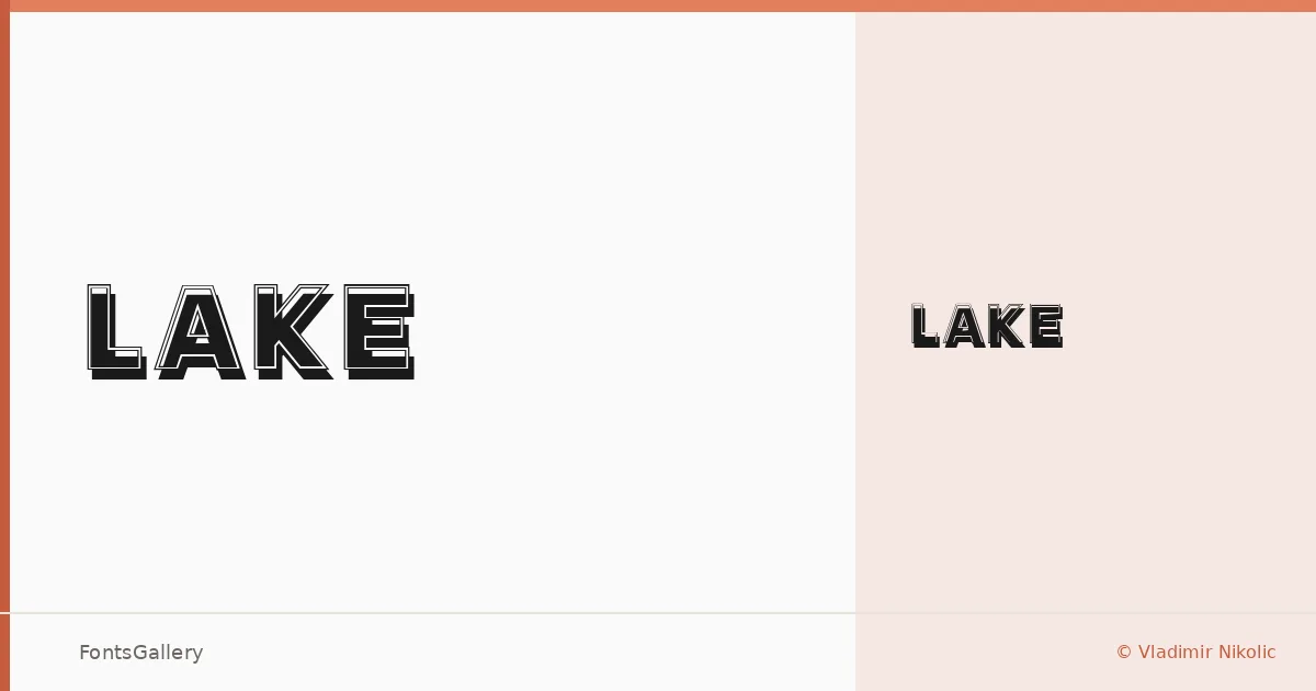
About Lake Font
There is something deliberately worn about this display face — the kind of weight and texture that suggests ink pressed into rough paper rather than pixels on a screen. Created by Vladimir Nikolic, it arrives as a single cut, Lake Regular, and carries that focused, unhurried confidence a single well-drawn weight can have when the designer commits fully to one voice.
Design Aesthetics & Character Characteristics
The category is Display, and the mood lands squarely in bold, rustic, vintage territory — letterforms that feel rooted in classic American hand-lettering traditions without directly quoting any single era. The weight is assertive without being clumsy, and the texture gives headlines a tactile quality that smooth geometric faces simply cannot fake. It ships as a TTF with partial Latin coverage, so it handles English and most Western European copy without issue.
Recommended Usage & Font Pairing
It earns its keep in branding, poster work, logo lockups, and T-shirt design — anywhere a headline needs to carry personality without leaning on illustration. Pair it against the clean rationalism of Helvetica or Bahnschrift when you want the contrast to do the talking, or set it alongside the editorial warmth of Canela or Times New Roman for something with a bit more narrative depth. Etna is worth exploring when you want two display voices in conversation rather than counterpoint.
License & Usage Terms
This family is available for commercial use under its stated license. Note that embedding is permitted for preview and print only, so confirm those terms before deploying in interactive or editable documents.