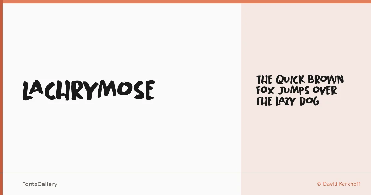
About Lachrymose Font
There is something deliberately torn about this face — the kind of texture that looks like it was inked by hand on rough stock and then left to dry unevenly. David Kerkhoff, working under his Hanoded Fonts imprint, built it as a single-weight display cut released in 2021, available in OTF format. The letterforms carry that grunge-and-whimsy tension that is genuinely hard to pull off: rough enough to feel raw, loose enough to feel alive.
Design Aesthetics & Character Characteristics
Lachrymose sits squarely in display territory — bold in presence, playful in construction, and grungy in detail. There is only the one weight, Regular, so the design has to do all its work through character alone, and it does. The partial Latin coverage means you are working within a focused glyph set, so check your character needs against the demo before committing to a layout. It arrives as an OTF file, clean to install and straightforward to use in any modern application.
Recommended Usage & Font Pairing
The face earns its keep on posters, T-shirt graphics, social media visuals, and anywhere a logo or branding mark needs personality over polish. For pairing, the structured neutrality of Helvetica or Aileron makes a strong counterweight to its roughness, while Aresink, Aranea, and Alexandria offer complementary character for layered display treatments where you want related energy across headline and supporting text.
License & Usage Terms
This is a Demo release, offered for personal, non-commercial use only — embedding is limited to preview and print; confirm a commercial license at www.hanodedfonts.com before taking it into any paid work.