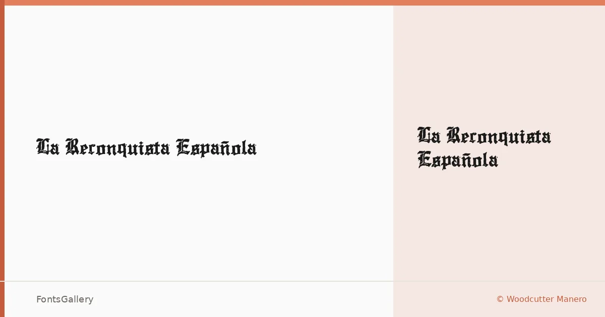
About La Reconquista Española Font
There is something deliberately heavy about this blackletter — the kind of weight that reads equally well pressed into a vintage beer label or screenprinted across the front of a T-shirt. It comes from Woodcutter Manero, released in 2024 under the woodcutter.es label out of Spain. The single Regular cut arrives in OTF format, and it carries the dense, angular structure that defines the blackletter tradition without softening it for contemporary tastes.
Design Aesthetics & Character Characteristics
The mood here sits squarely in bold, classic, grunge, and vintage territory — which is to say it feels equally at home referencing medieval manuscripts and underground zine culture. Gothic strokes are firm and deliberate, with the kind of texture that ages well at large sizes. Because the family offers one style — Regular — the design relies entirely on the strength of its forms rather than a range of weights, which suits headline and display use where a single commanding voice is exactly what you need.
Recommended Usage & Font Pairing
This face is built for high-impact Latin-script work: posters, logos, branding with a gritty or historical edge, and T-shirt design where the letterforms carry the whole composition. At smaller sizes the blackletter structure becomes difficult, so keep it large and give it room. For contrast, the listed pairing recommendations — Etna, Canela, Helvetica, ABC Arizona, and Bahnschrift — offer a useful range from humanist serif to geometric sans, any of which can take on body text while this face commands the headline.
License & Usage Terms
This family is released under Personal Use terms, which means it is not cleared for commercial work — confirm before taking it into a paid job by contacting Woodcutter Manero directly at [email protected] or visiting woodcutter.es for licensing details.