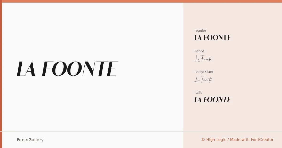
About La Foonte Font
There is a deliberate tension running through this family — a pull between the composed geometry of its sans cuts and the loose, expressive energy of its script variants. Rinto Dwi Nugroho of Almeerastudio built four distinct styles that sit together as a coordinated system: a Regular, a Regular Italic, a Script, and a Script Slant, all delivered in OTF format. The script strokes in particular carry a calligraphic confidence that suits ceremonial and luxury contexts without tipping into pastiche.
Design Aesthetics & Character Characteristics
The family sits squarely in the display category, leaning into a classic, elegant sensibility that also reads as contemporary — the sans cuts are clean and structured, while the script and slanted script variants introduce rhythm and movement. That combination of upright restraint and flowing cursive gives designers genuine range within a single cohesive release. Latin is the supported script, and the letterforms are optimised for large-scale applications where contrast and silhouette do the heavy lifting.
Recommended Usage & Font Pairing
The family is best suited to branding, logo work, poster design, magazine layouts, and wedding stationery — anywhere the balance of luxury and modernity earns its keep. The sans styles hold headlines and logotype lockups with authority, while the script cuts handle invitation copy, editorial pull-quotes, and packaging accents. For pairing, the family has been paired with Etna, Canela, Helvetica, ABC Arizona, and Bahnschrift — a range that covers editorial neutrals and sturdy grotesques alike, giving you solid options depending on whether the surrounding text needs to recede or hold its own.
License & Usage Terms
This family is offered under Personal Use terms; the license notes reference commercial use separately, so confirm licensing directly with Almeerastudio before deploying it on a client or commercial job. Embedding is permitted at the installable level.