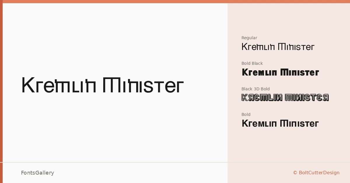
About Kremlin Minister Font
There is real weight behind these letterforms — the kind of deliberate, authoritative stroke that belongs to constructivist signage and old broadsheets. Kremlin Minister is a display family designed by BoltCutterDesign, working in a bold, vintage idiom that sits somewhere between institutional gravitas and grunge energy. The capitals carry that pressure well, feeling as though they were cut for large formats rather than coaxed into them.
Design Aesthetics & Character Characteristics
The family ships in four TTF cuts: a Regular, a Bold, a Black, and a Black 3D Bold — the last of these adding dimensional depth that suits dimensional signage, screen printing, and layered poster work. The overall mood is classic but with a roughness underneath, the kind of classic that has been through something. At headline sizes, the contrast between the standard weight and the Black reads as deliberate hierarchy; the 3D Bold cut adds theatricality without breaking that coherence. Latin coverage is partial, so verify character support against your specific copy before committing to a multilingual layout.
Recommended Usage & Font Pairing
The natural home for this family is anywhere scale and authority matter: branding marks, poster headlines, logo lockups, and T-shirt graphics all sit comfortably in its wheelhouse. For pairings, the clean geometry of Bahnschrift or Helvetica creates useful tension against the vintage weight, while Canela's editorial softness or the familiarity of Times New Roman can ground a layout that needs some relief from the heaviness. Etna offers another structured option when the overall design wants to stay in a bold, structured register throughout.
License & Usage Terms
Released under the GNU General Public License with freeware terms, this family allows commercial use. Embedding is set to editable, meaning documents using the font can be opened and modified by recipients.