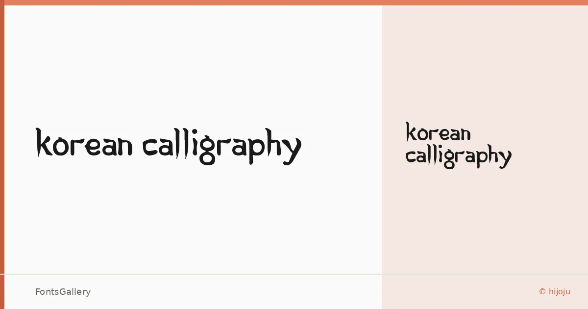
About Korean Calligraphy Font
There is an unmistakable looseness to these letterforms — a brushed energy that feels pulled from hand rather than drawn on a grid. The face was designed by hijoju and built in a single cut, Regular Normal, delivered as a TTF file. What makes it immediately interesting is the way calligraphic gesture survives the translation into a Latin display face, keeping strokes that feel authored rather than engineered.
Design Aesthetics & Character Characteristics
This is a display family in the most honest sense: one weight, built for size, carrying a mood that sits somewhere between modern confidence and playful whimsy. The forms lean expressive — variable stroke widths, a hand-drawn cadence — which gives headlines and short bursts of text a kinetic quality that static geometric faces simply cannot fake. Coverage extends across Latin, Cyrillic, and Greek, so the brush character carries across scripts rather than dropping off at the edges of the Latin set.
Recommended Usage & Font Pairing
The calligraphic weight earns its place in branding, logo lockups, poster headlines, and social media graphics where attitude matters more than neutrality; it also translates well to T-shirt design, where the hand-drawn quality reads as intentional craft at garment scale. When you need a counterpart to ground it, the listed pairing options cover a wide tonal range — the clean rationalism of Bahnschrift or Helvetica will let this face do all the talking, while Canela brings a softer editorial contrast, and Times New Roman offers a more classical tension against the brushwork. Etna rounds out the options for moments when a secondary display face is needed rather than a workhorse text companion.
License & Usage Terms
This family is available for commercial use under its stated license, and embedding is permitted at the editable level, making it straightforward to deploy in documents and design files without additional clearance.