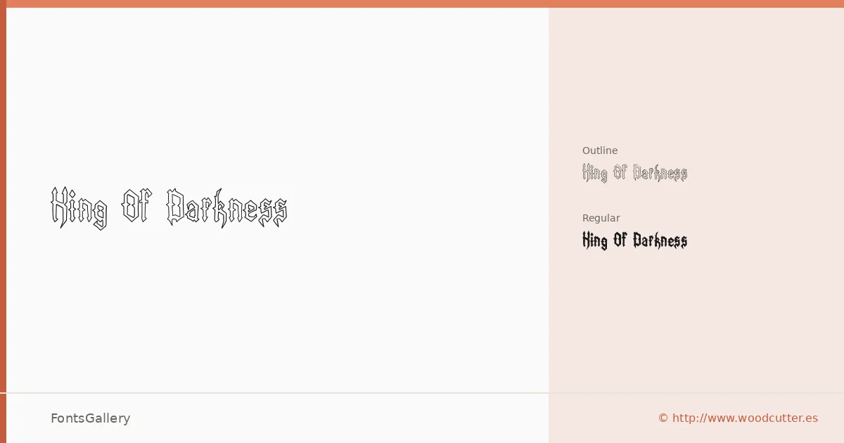
About King Of Darkness Font
There is a deliberate heaviness to these letterforms — thick strokes pushed to their edges, with a grunge undertone that reads as worn, weathered, and intentional. The family comes from Woodcutter Manero, whose work is rooted in that ornamental, high-contrast display tradition. Two cuts are available in OTF format: a solid Regular and a companion Outline Regular that lifts the same silhouette into open, stroke-only forms.
Design Aesthetics & Character Characteristics
This is a display face in the boldest sense — classic in its skeleton, vintage in its texture, and grunge in its finish. The two styles work in tandem: the solid cut commands attention at large sizes, while the outline version adds a layered or ghosted quality useful when you need the same weight without the full visual mass. Both are set in Latin and delivered as OTF files.
Recommended Usage & Font Pairing
The natural territory here is anywhere drama is the brief — book covers, posters, logo lockups, and T-shirt graphics where a rough, commanding headline is exactly what is needed. For branding work, it pairs well against the clean geometry of Helvetica or Bahnschrift, the editorial warmth of Canela or ABC Arizona, and the structured character of Etna, each of which gives the eye somewhere to rest after the display weight has done its work.
License & Usage Terms
King Of Darkness is released under Personal Use terms — commercial use is not permitted, so confirm licensing before taking it into a paid job by contacting [email protected] or visiting http://www.woodcutter.es.