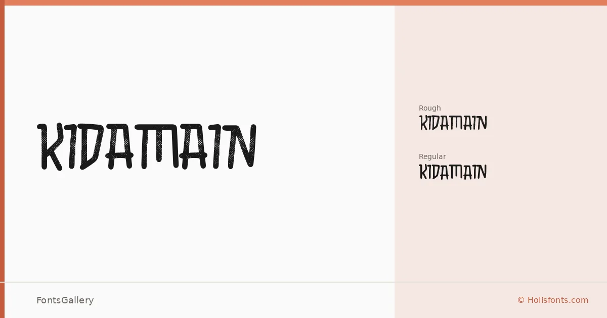
About KIDAMAIN Font
There is a rawness to these letterforms that reads immediately — thick strokes with an uneven, handcrafted edge that feels deliberately worn rather than accidentally so. The family comes in two cuts: a Regular and a Rough variant, the latter pushing the grungy, distressed quality further with surface texture that mimics weathered print or degraded ink. Both are delivered as TTF files, designed by Holisfonts.com.
Design Aesthetics & Character Characteristics
This is a display face built for impact — bold, rustic, and steeped in a vintage sensibility that suits work needing genuine character over polish. The Regular holds its grunge in the underlying structure, while the Rough variant introduces visible deterioration across the letterforms themselves, giving it a more aggressive, tactile presence. Neither cut is meant for running text; both are built to command a headline or anchor a composition at large sizes.
Recommended Usage & Font Pairing
The natural territory here is branding with attitude — logos, posters, and T-shirt graphics where a worn, hand-pressed quality earns its place rather than feels forced. It covers Latin script with partial extended Latin support, which covers the needs of most Western-market print and merchandise work. For pairing, the contrast between this family's rough display weight and the clean geometry of Bahnschrift or Helvetica works well for hierarchy, while Canela or Times New Roman brings a more editorial tension; Etna offers a middle ground with its own structured character.
License & Usage Terms
No license terms have been specified for this family — confirm usage rights directly with Holisfonts.com before applying it to any commercial project. Embedding is permitted at the installable level.