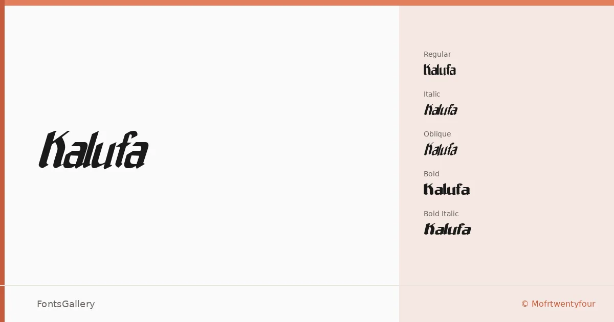
About Kalufa Font
There is a deliberate roughness to Kalufa's edges — the kind that reads as intentional grit rather than careless construction. Created by Mohamad Farhan Ramadhan of Mofrtwentyfour, it was built in FontLab and carries the confident weight of a display face that knows exactly where it belongs. The letterforms hold a tension between modern structure and vintage wear, giving headlines a lived-in authority.
Design Aesthetics & Character Characteristics
This is a display family in the grunge-meets-modern tradition, released in five cuts: Regular, Italic, Oblique, Bold, and Bold Italic — all available as TTF files. The regular weight stands firm and upright, while the italic and oblique angles add motion without losing the face's underlying toughness. The bold cuts amplify that energy considerably, pushing the texture into genuinely commanding territory. Across all styles, the Latin character set is consistent and clean enough to hold up at large sizes where every curve and grain-edge is visible.
Recommended Usage & Font Pairing
The family is built for high-contrast contexts — posters, brand identities, logotypes, and T-shirt graphics where the roughened character reads as personality rather than noise. At headline scale it earns its keep. For body copy or supporting text, it pairs well against the clean geometry of Helvetica or Aileron, the softer lines of Aranea, or the structured neutrality of Aresink and Alexandria, each providing enough contrast to let the display weight breathe.
License & Usage Terms
Kalufa is offered under Personal Use terms, which means commercial use is not permitted — confirm licensing directly with Mofrtwentyfour before placing it in any paid or client-facing work. Embedding is restricted to preview and print only.