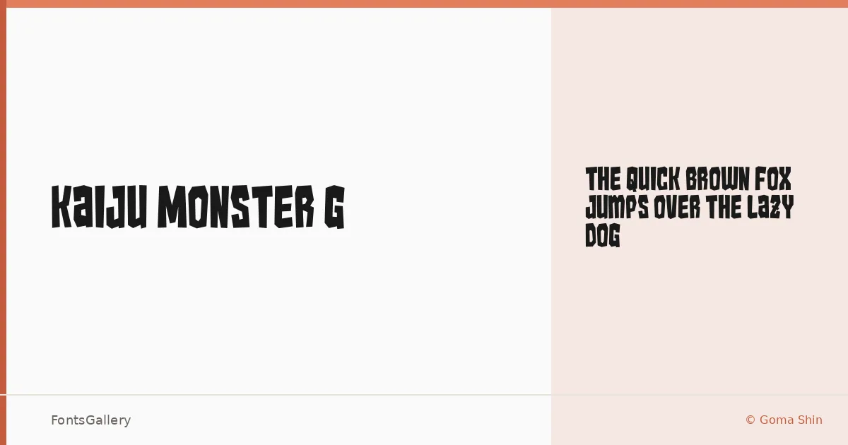
About Kaiju Monster G Font
There is something deliberately rough about this display face — letters that look like they were carved under pressure, each stroke carrying the weight of a grunge aesthetic that feels earned rather than applied. It was designed by Goma Shin, and the single Regular cut is the whole statement: one style, no apologies.
Design Aesthetics & Character Characteristics
This is a display typeface built for impact, sitting squarely in bold, rustic, vintage territory with a grunge edge that keeps it from feeling nostalgic in any soft way. The forms are heavy and textured, the kind of letterforms that read across a room before anyone gets close enough to study the details. Available as a TTF in its single Regular weight, it delivers Latin coverage and a character that is hard to fake with cleaner alternatives.
Recommended Usage & Font Pairing
It earns its place on posters, band merch, T-shirt designs, and logo work where a raw, confrontational headline is the point — branding that needs to feel lived-in rather than polished. Pair it with something that pulls in the opposite direction: the elegance of Canela or ABC Arizona will create strong contrast, while the rationalism of Helvetica or Bahnschrift grounds it without competing; Etna offers a middle path, sharing some structural weight without the grit.
License & Usage Terms
Kaiju Monster G is available for commercial use, so it is cleared for client work and production jobs. The TTF is licensed with editable embedding permissions.