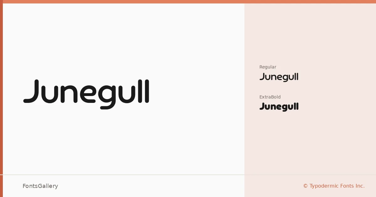
About Junegull Font
There is a clean, assertive confidence to these letterforms — wide stances, minimal decoration, and the kind of geometric resolve that reads instantly at large sizes. Ray Larabie of Typodermic Fonts Inc. designed this display family, and the result carries that studio's characteristic precision: nothing wasted, nothing soft. It ships in OTF format and covers Latin, Vietnamese, and Cyrillic scripts.
Design Aesthetics & Character Characteristics
The family sits firmly in the display category, built for headlines and identity work rather than running text. Two cuts are available — Regular and ExtraBold — and the jump between them is deliberate enough to give you genuine contrast within a single job. The mood is modern and minimal, with the bold weight pushing into genuinely heavy territory without losing the underlying geometric calm of the Regular.
Recommended Usage & Font Pairing
It earns its keep in branding, logo lockups, posters, and website headers — anywhere a professional, stripped-back presence matters more than warmth. The Cyrillic and Vietnamese coverage makes it a reasonable choice when those markets overlap with your project. For text companions, it has been paired with Etna, Canela, Helvetica, AQUA, and Bahnschrift, each offering a different tonal contrast against its cool, structural weight.
License & Usage Terms
Junegull is available under Personal Use terms, which means commercial use is not permitted — confirm licensing directly with Typodermic Fonts Inc. before taking it into a client or commercial job. Embedding is limited to preview and print only.