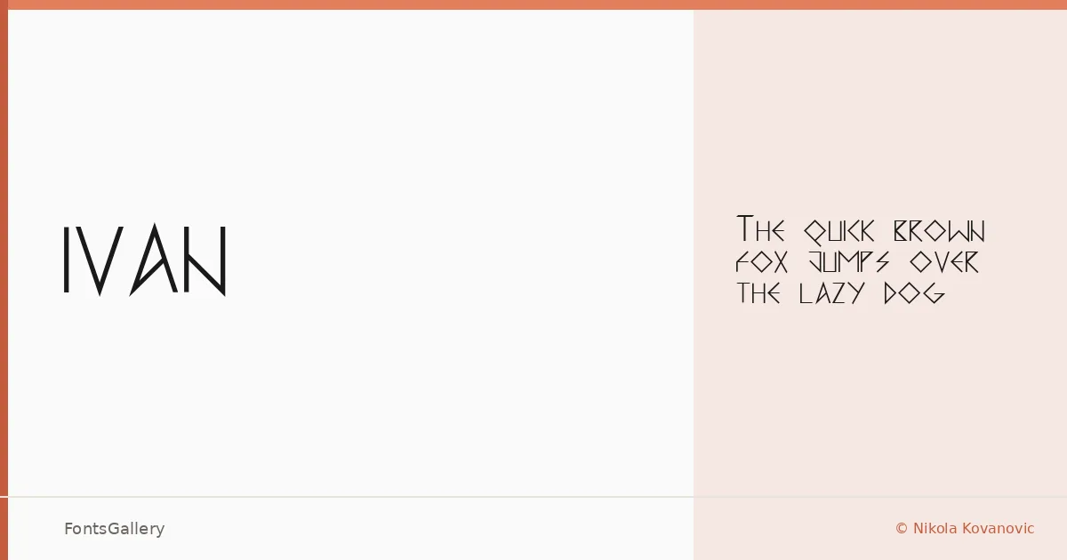
About IVAN Font
There is a clarity to this display face that earns attention without demanding it — each letterform pared back, composed, nothing borrowed from decoration. Designed by Nikola Kovanovic, it arrives as a single Regular cut in TTF format, a deliberate restraint that suits the work it was made for. Its Cyrillic coverage gives it a distinct and specific identity, rooted in a script that rewards type designers who understand its rhythm rather than merely transliterating Latin forms.
Design Aesthetics & Character Characteristics
The mood here is elegant and minimal — the kind of modern that does not shout. As a display category face, it is built for size: the proportions open up at headline scale, holding their composure without going cold. The single weight means every decision about emphasis has to come from context and layout, which is actually a useful discipline. Letters feel considered rather than systematic, with just enough individual character to read as crafted.
Recommended Usage & Font Pairing
Branding, logo work, poster headlines, and website headers are where this face finds its footing — anywhere Cyrillic display typography needs presence without ornament. It pairs well with Canela for editorial warmth, Helvetica or Bahnschrift when you need a clean neutral beneath it, and Etna or AQUA when the project calls for something more textural in the supporting role.
License & Usage Terms
Released under Personal Use terms — the license note specifies free use excluding commercial applications, so confirm clearance with Nikola Kovanovic before committing it to any paid work. Embedding is permitted at the installable level.