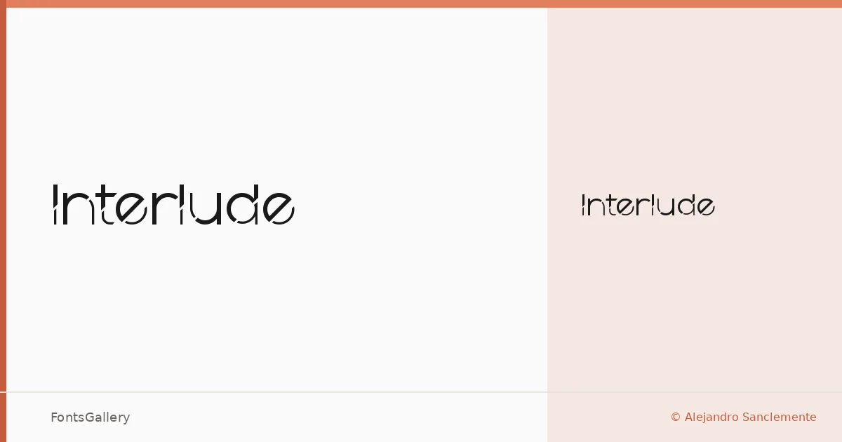
About Interlude Font
There is a deliberate quietness to this display face — the kind that comes from restraint rather than simplicity. Designed by Alejandro Sanclemente, it arrives as a single Regular Normal cut in TTF format, built with enough presence to carry a headline without crowding the page around it.
Design Aesthetics & Character Characteristics
The mood sits at the intersection of elegant and minimal, with a modern sensibility that keeps the forms clean and unforced. As a display category typeface, it is drawn for size — the details read at heading scale in ways they simply cannot at body text. The single weight encourages you to let the letterforms do the work rather than leaning on contrast between cuts. Latin script is supported, though coverage is partial, so checking your character requirements against the glyph set before committing is worth doing.
Recommended Usage & Font Pairing
It fits naturally into branding and logo work where a restrained, modern tone is the brief, and it holds its own across editorial contexts — magazine covers, poster headlines, campaign titles. For text companions, it has been paired with Bahnschrift and Helvetica on the neutral-sans end of the spectrum, Canela and Times New Roman where a touch of warmth or classical weight is needed, and Etna for something with a little more character underneath.
License & Usage Terms
Interlude is released under a Personal Use license, which means commercial use is not permitted — confirm the terms directly with the designer before applying it to any client or revenue-generating work. Embedding is set to editable.