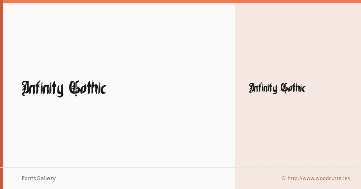
About Infinity Gothic Font
There is a particular density to blackletter that either commits fully or falls apart, and this one commits. Released under the Woodcutter Manero "Fonts Lab" imprint, it arrives as a single Regular weight in OTF format — a deliberate, focused cut rather than a sprawling system.
Design Aesthetics & Character Characteristics
The blackletter construction leans into bold, classic territory with a grunge edge that keeps it from feeling purely archival — it reads as vintage without being a museum piece. That single Regular carries enough visual mass for headline work, and the compressed gothic strokes hold their authority at display sizes where this kind of face earns its keep. Latin coverage keeps the character set tight and purposeful.
Recommended Usage & Font Pairing
The natural home for these letterforms is anywhere the brief calls for weight and attitude: posters, logo lockups, t-shirt graphics, and branding that wants historical gravity without apology. For contrast pairings, the clean geometry of Helvetica or Bahnschrift cuts against the gothic texture effectively, while Canela and ABC Arizona bring a more editorial softness to the combination — Etna is also listed as a recommended companion if you need something with its own structural character.
License & Usage Terms
This family is distributed under Personal Use terms, meaning commercial work is not covered — confirm licensing directly with the designer at [email protected] or via http://www.woodcutter.es before taking it into a paid job.