About Immortal Font
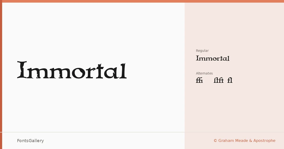
There is a deliberate heaviness to this blackletter — the kind of density that feels earned rather than decorative. Graham Meade and Apostrophe, working under the Apostrophic Labs banner, built two cuts: a standard Regular and a companion Regular Alternates that gives you additional glyph choices to push the texture further. Both are delivered as TTFs with installable embedding permissions.
Design Aesthetics & Character Characteristics
This is blackletter drawn for Latin text, and it carries the full weight of that tradition — the thick strokes, the angular terminals, the rhythm that reads as simultaneously classic and grunge. The alternates cut offers enough variation in certain letterforms to shift the overall tone, making the composition feel hand-assembled rather than mechanically set. The mood is bold and vintage without softening into nostalgia.
Recommended Usage & Font Pairing
The family earns its keep in display work: book covers, posters, logo lockups, and T-shirt graphics where that commanding blackletter weight is exactly the point. Branding that needs historical authority or an edge-forward attitude sits comfortably here. It contrasts well against clean, open faces — pairings with Helvetica or Asap will let the blackletter breathe, while Canela, Etna, or ABC Arizona offer more editorial warmth when a softer contrast is wanted.
License & Usage Terms
The family is available for commercial use, and the embedding is set to installable, so you can deploy it across documents and applications without restriction beyond the standard copyright held by Graham Meade and Apostrophic Labs.